
How to use colourful fabrics in your bar or restaurant
- August 11th, 2023
-
 Inspiration
-
 Bars & Restaurants
Colour can have a profound effect on how we feel in a hospitality setting. The clever use of colour can influence our mood, energy and even our appetite. A big factor to consider if you’re in the food business!
Where once hoteliers and restaurateurs used to stick to dark, unimaginative colours for practicality, they can now explore the rainbow thanks to FibreGuard’s wide range of stain-resistant, durable fabrics.
In this blog post, we’re looking at some of ways you can add texture and interest to your hospitality spaces with colourful fabrics.
Yellow is known to be a very stimulating colour that can make people feel more awake and energised. It's a great, 'friendly' choice for fast-food eateries, cafes and bistros, as well as more casual dining establishments.
Yellow is usually associated with bubbly happiness, overflowing with enthusiasm and optimism. Perfect for cheery bistros! Browse our special Pinterest board dedicated to the joy of yellow.
Why use colourful textiles in your hospitality setting?
The use of colour in your bar or restaurant can have a powerful effect on how diners perceive a space. Because of this, the way you incorporate colourful fabrics into your interior design could make all the difference to your guests’ opinion of your establishment.
Colour psychology tells us that different hues can directly affect our behaviour, so it’s crucial to give careful consideration to the use of colour in your hospitality space.
From upholstery to drapes to table linens, effective colour selection can make a lasting impression in the minds of your visitors.
“When designing a bar or restaurant, it’s important to consider what you want your guests to think, how you want them to feel and what actions you want them to take while dining at your establishment. Colour is one of the most important factors in every one of these design considerations, so it shouldn’t be just an arbitrary choice. Colour should be a decision that’s made after thoughtful deliberation, because it creates an atmosphere – be it upscale or fast food – and can actually stimulate or suppress a customer’s appetite.” – Dala Al-Fuwaires, Principal Designer, House of Form, Arizona
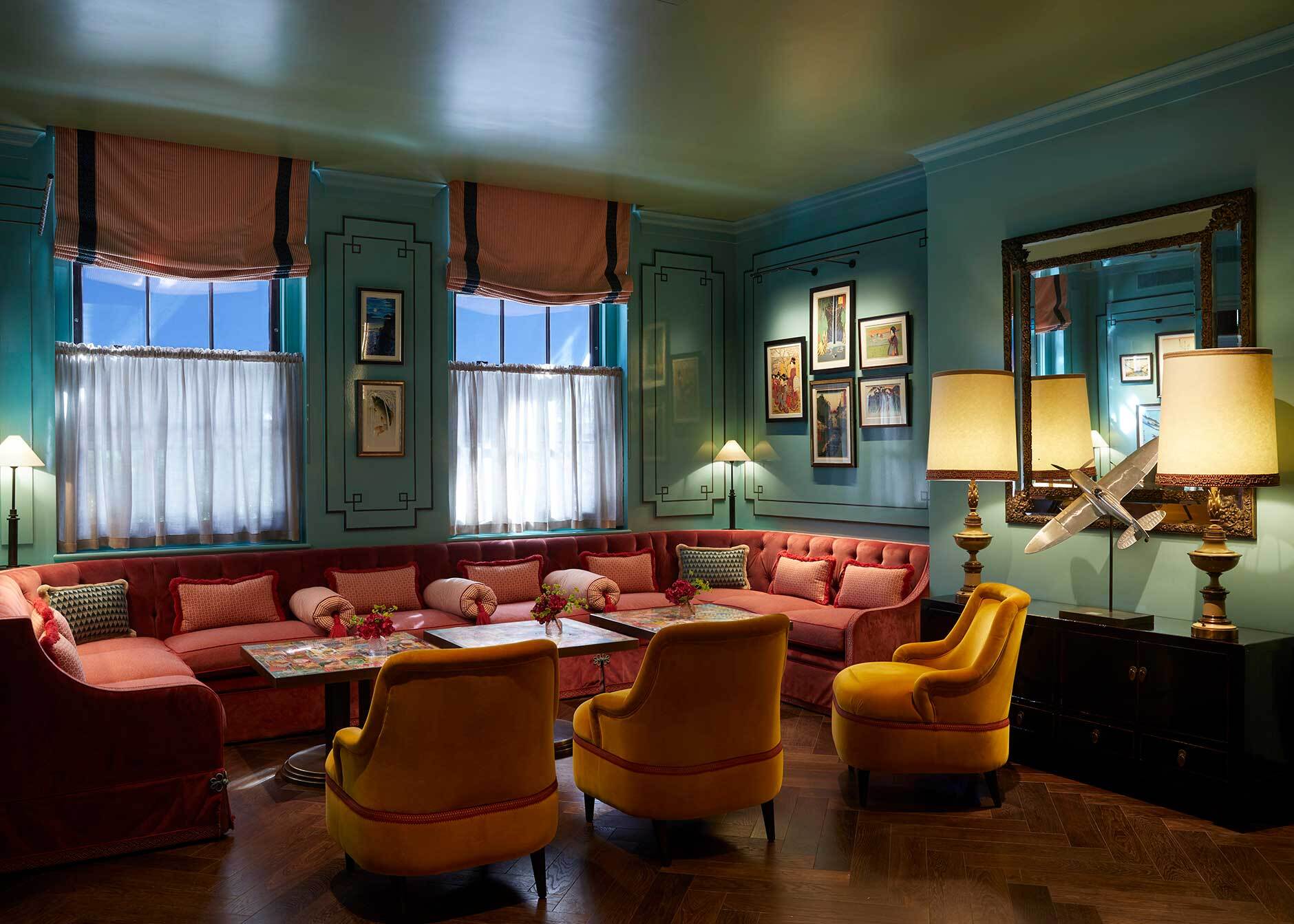
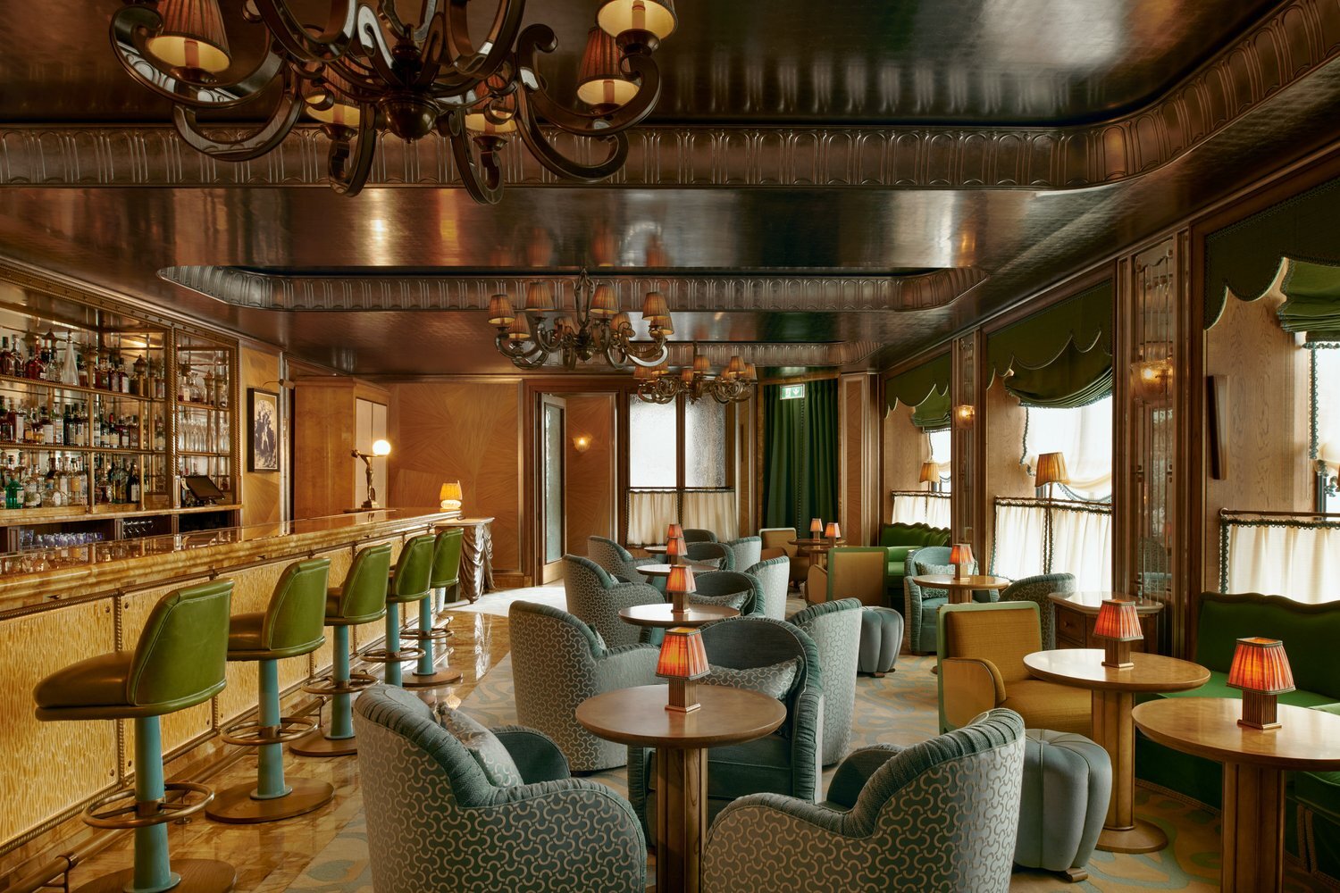
Beautiful, sophisticated emerald green velvet at the Vesper Bar at The Dorchester, Mayfair, London. Keep scrolling for more photos of this fabulous location!
Sir Frank’s Bar, designed by Nicola Harding, is awash with colour, texture and glamour. But she makes everything work in unison: a wonderful example of a true interior design artist.
How does colour affect restaurant diners' experience?
Colour psychology has a major part to play in restaurant design. So it’s worth taking a look at the impact different hues can have on your visitors’ experience.
Red is an exciting, stimulating colour which has been shown to increase guests’ heart rates and boost their appetites.
Red can also encourage people to eat more quickly, which is perfect for establishments requiring rapid turnarounds, such as fast-food restaurants. However, red is also associated with danger, so it’s a colour to use in moderation if you don’t want to startle or overwhelm your customers.
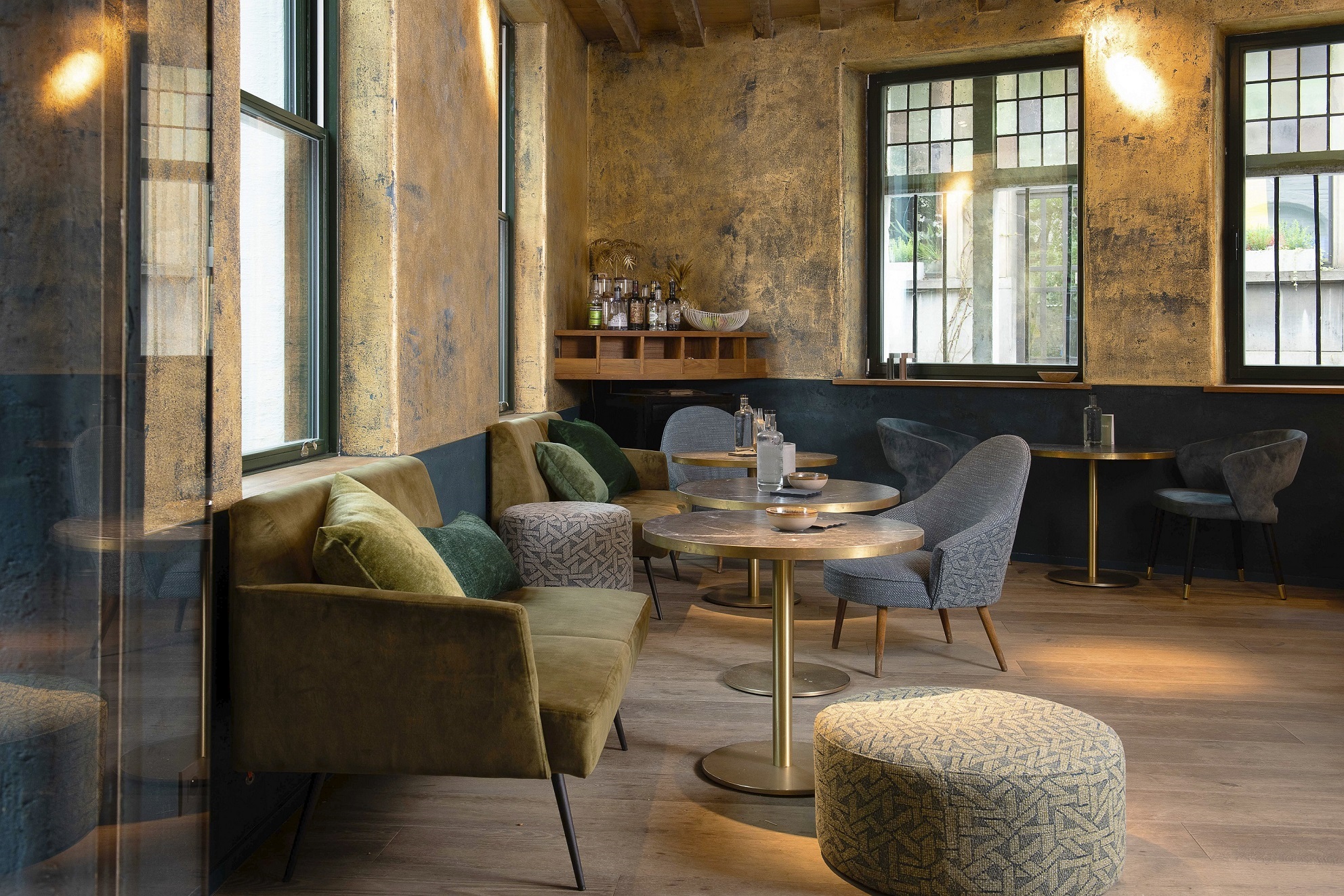
More calming palettes for hospitality spaces tend to include earthy greens and browns.
These colours reflect the natural world and, as a result, make us feel grounded and safe.
These restful hues inspired by nature are the perfect choice for contemporary restaurants and bars where we want to encourage clientele to stay awhile and make themselves at home.
“When walking into a business interior that uses the colour green, you start to relax. We are reassured by green on a very primitive level. Where there is green, we can find food and water – it equals life. Green falls in the middle of the colour spectrum and the eye requires very little to no adjustment to be able to see it. It is, therefore, a very restful colour, and indicative of balance and harmony.” – Colour psychologist Karen Haller, author of 'The Little Book of Colour'
Blue, on the other hand, should be avoided for hospitality spaces as it can feel cold and unwelcoming.
And, because there are so few naturally-occurring blue foods, blue is the colour most likely to suppress the appetite. A real no-no for hospitality environments! The only exception to this rule is coastal bars and restaurants. Incorporating blue in these interior schemes can work because the colour reflects the surrounding sea and sky.
Pastel colours have dominated the restaurant colour design scene for years and are still popular among designers and restaurateurs.
The natural tone of soft, light colours such as sky blue, pale pink or light green fits most types of restaurant decors, which is one of the main reasons behind the popularity of this colour trend.
Inspiring examples of the effective use of colour in hospitality design
EXAMPLE 1: Beaverbrook Townhouse, Chelsea, London
Sir Frank’s Bar at Beaverbrook Townhouse is awash with colour, texture and glamour. Iridescent blue tiles line the bar which is surrounded by stools upholstered in raspberry pink leather.
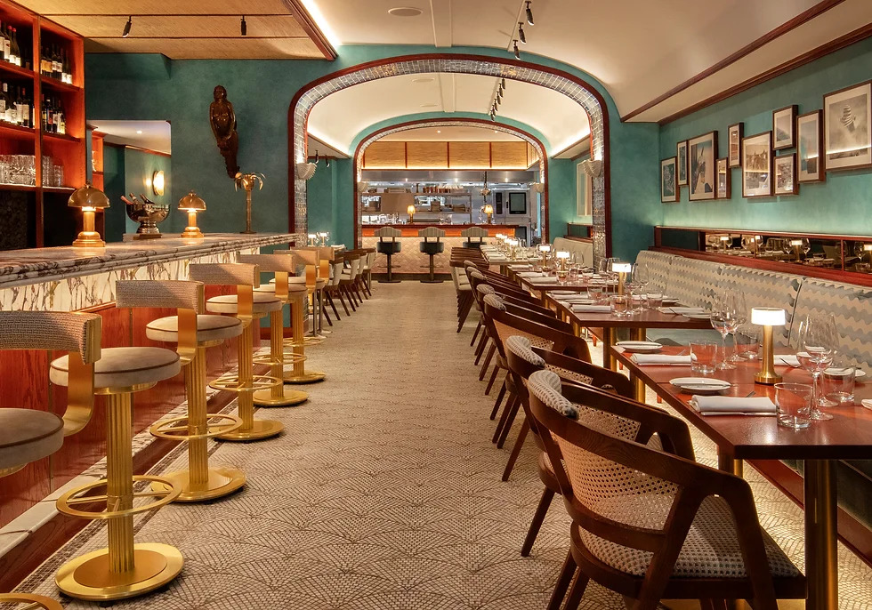
EXAMPLE 2: Saltie Girl, Mayfair, London
Fish restaurant, Saltie Girl, presents a riot of maximalist colour and pattern. Handmade pink fish-scale tiles grace the floor and the welcoming banquette seating is upholstered in a bold green striped fabric.
EXAMPLE 3: Vesper Bar at The Dorchester, Mayfair, London
Designed by legendary decorator Martin Brudnizki, the Vesper Bar is a masterclass in colourful elegance. The chairs are upholstered in a geometric jacquard and the sofas are covered in opulent emerald velvet.
How to choose the right colourful textiles for your bar or restaurant
So you know you need to inject some welcoming colour into your bar or restaurant, but how do you go about choosing the right fabrics for the job? Check out our ideas…
- Create a harmonious colour scheme
To achieve a cohesive look, either choose colours that will complement the existing décor, or bring together a new combination of colours to create a pleasing, tonal aesthetic.
- Match the colours to the ambience you wish to create
Choose pops of red or orange for an upbeat vibe, or neutral tones such as beige or ivory for a fresh and sophisticated feel.
- Select hard-wearing textiles that are easy to keep clean
For demanding commercial environments, it’s essential to choose tough fabrics that will stand up to the rigours of constant, daily use.
When it comes to selecting high performance textiles for your bar and restaurant, FibreGuard fabrics have got you covered. That’s because our fabrics have the following, market-leading qualities…
- Stain-resistant
- Extremely durable and fade-resistant
- High quality and luxuriously soft
Related read: FibreGuard at Mike's Kitchen Restaurants
A darker colour scheme can be a perfect choice for restaurants wishing to give their space a more romantic and intimate feel.
FibreGuard fabrics are luxuriously soft to the touch, which is amazing given how durable they are. Related read: Style spotlight on bouclé yarn and FibreGuard fabrics
Thanks to their embedded stain-free technology, our performance fabrics are easily cleanable with water, even with such notorious stains as coffee and wine. The FibreGuard stain-resistant effect is permanent which means our fabrics continue look as good as new, wash after wash.
FibreGuard Pro fabrics, which have been specifically developed for commercial environments, are even more perfect for bars and restaurants because their embedded moisture barrier prevents liquid from passing through the fabric.
Designed to perform in demanding environments, FibreGuard fabrics are colourfast. They won’t fade, even after prolonged exposure to sunlight. Read more about our testing procedures here.
Despite their impressive durability, FibreGuard fabrics are luxuriously soft to the touch, making them the perfect choice to bring warmth and texture into your hospitality space.
Incorporating colourful textiles for maximum restaurant impact
We’ve established the fact that colour can influence your diners’ experience and perceptions. But how can you incorporate colourful fabrics to achieve the results you want? Here are our top three tips…
- Create a focal point
Colourful upholstered seating such as a banquette can be a great way to create a focal point. Introducing fabric into your interior scheme also has the added bonus of improving acoustics.
- Combine colour with texture
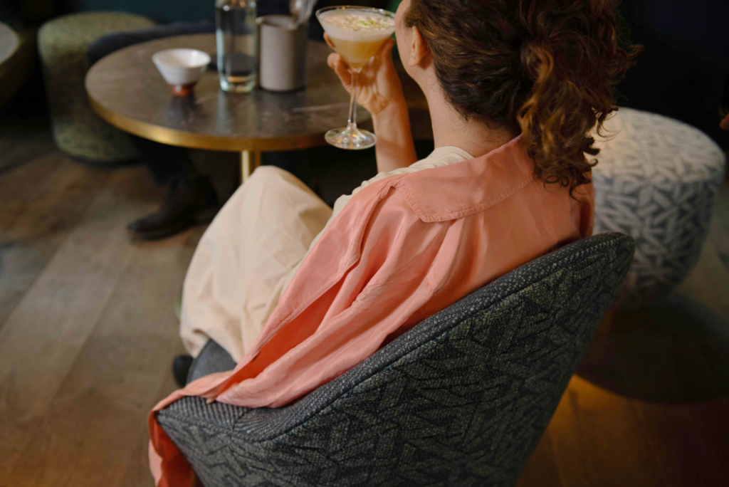
Natural textures such as seagrass, rattan or bamboo work really well with earthy colours such as moss green and chocolate brown. This combination helps diners feel cocooned and comforted by their surroundings.
- Bring in contrasting colours
Create a visual treat for your customers with bold colour combinations. Choose tones that sit on opposite sides of the colour wheel for maximum impact such as green paired with red, or orange combined with blue.
To sum up, colour can have a major impact on the way visitors perceive your bar or restaurant. It can affect everything from the amount of food they order to the length of time they choose to stay in your establishment, which is why it’s crucial to get your colour choices spot on.
Click here to get in touch and explore the full range of FibreGuard’s stain-resistant performance fabrics. Available in a wide variety of colours and textures, our beautiful, restaurant-ready textiles are the perfect choice for your hospitality project.