
How to use colour psychology in your restaurant interior design
- July 26th, 2019
-
 Inspiration
-
 Bars & Restaurants
The use of colour in the interiors of truly great restaurants is not an arbitrary choice and never should be.
From the stain-resistant fabrics on your banquette seating to the contract upholstery fabrics adorning your dining chairs, colour affects far more than just the visual impression of a space.
It touches on the mood of your guests and can even influence their eating or spending habits. The right restaurant fabrics don't just need to look good—they need to perform well too.
With PFAs-free upholstery options like FibreGuard's performance fabrics, restaurant owners can create spaces that are both psychologically appealing and practical. Read on about the psychology of colour and what harnessing it can mean for your bar or restaurant interior.
Colour Creates Experience: The Impact of FibreGuard Performance Fabrics
Colour can be the difference between your restaurant being defined by customers as the place to grab a quick bite, the spot to enjoy a leisurely coffee and dessert, or the destination to really savour a full three-course meal.
In other words, a street-side diner with bright, easy-to-clean stain-resistant fabrics attracts one kind of patron, while haute cuisine establishments with luxurious contract upholstery fabrics attract another.
Bar and restaurant owners usually know exactly who their target market is and make deliberate choices in their interior design—including restaurant fabrics—to appeal to that segment of the population.
The durability and aesthetic appeal of PFAs-free upholstery like FibreGuard performance fabrics allow design flexibility without compromising on practicality or style.
If you're just starting out and aren't too sure what direction you want to go in, we recommend working with a branding team and an interior designer to maintain a consistent style and make the best fabric and colour choices for your unique restaurant concept.
Related read: How to use colourful fabrics in your bar or restaurant >
Related case study: Our easy-clean upholstery is perfect for Ethos restaurant
Intentional Fabric and Colour Choices in Restaurant Design
Intentional choices in restaurant design, from FibreGuard performance fabrics to strategic color schemes, can help set the expectations of your clientele and attract the kinds of diners you want.
Colour, though, is a huge spectrum. Even using generic names for colours, such as red, blue, yellow, can be limiting, as within each colour there's a world of shade and variance—much like the range of options available in stain-resistant fabrics for different restaurant environments.
Dining Room Colours Influence How People Eat
Colour can even go so far as to influence diners' eating habits.
No, really.
Grey or black contract upholstery fabrics, for example, are better suited for sleek reception areas rather than in a dining space, as they diminish the appetite at best, or at worst literally repel people from the thought of eating. That's seriously not what you're looking for in your restaurant fabrics.
So what does work then?
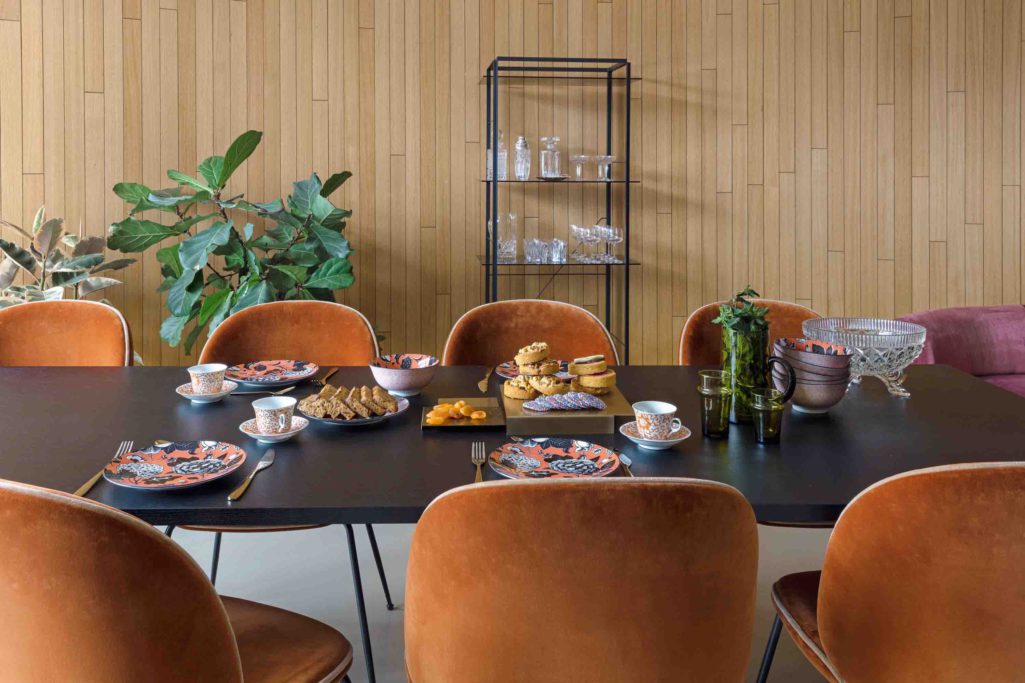
Well, we've discovered that red, orange and yellow tones are the best to go with if you're decorating your bar or restaurant, as they stimulate the appetite far more than cooler tones could ever hope to do.
These warm tones work beautifully with FibreGuard's PFAs-free upholstery options, creating inviting spaces that encourage diners to settle in and enjoy their meal.
Colours that are great for dining room furniture upholstery
Colours that can lend a helping hand trend towards green and turquoise and some shades of blue, simulating a feeling of good health and calm wellbeing in the minds of your customers. When you think about it, you realise that there is actually a reason salad bars have green or turquoise interiors.
Colours not only affect the eating or drinking habits of your customers, they affect their moods as well. For this reason, colour in interior design has a bit of a knock-on effect. Let’s look at that for a moment:
- Decorating in warm shades heighten the mood as well, taking on a double duty to entice your clientele into having a good time.
- Having a good time will give them pleasant memories of their experience at your restaurant.
- These feel-good memories in turn will play a large part in inviting your clientele to come back for a repeat visit.
Use your knowledge of colour psychology to make your other design decisions
This blog post touches on colour theory, a design-centric system that might not stray often into the everyday lives of bar and restaurant owners and managers. It is, however, a vital tool in the arsenal of the interior designer. We advise to begin with your colours and branding, and then go from there to let those colours help you make your other design decisions.
Let's Create Your Colourful Restaurant Story
We've explored the powerful psychological effects of colour in restaurant interior design and how the right fabric choices can enhance your guests' dining experience. Whether you're renovating an existing space or starting fresh with a new concept, remember that thoughtful colour and fabric selections can significantly impact your restaurant's success.
Ready to transform your restaurant interior with the perfect combination of colour psychology and high-performance fabrics? Connect with us on Instagram to share your ideas, experiences, or questions about implementing FibreGuard performance fabrics in your next design project.