
The essential colour aesthetic guide from FibreGuard’s design team
- February 4th, 2022
-
 Trends and insights
-
 Residential
Loving colour is kind of our job – which is fantastic because it’s our passion too! Our FibreGuard design team knows instinctively that colour has an immediate influence on a space, whether we are even conscious of it or not. Colour combinations affect us too as humans, and most people aren’t even aware of their influence.
Today we bring some crisp new colour learnings from digital culture together with our own colour experts’ insights from the FibreGuard team.
What are 'aesthetic' colours?
While the concept of ‘aesthetics’ is centuries old, its modern resurrection is thanks to digital culture and Tumblr in the 2010s, to be specific. In the 2010s, ‘aesthetic’ was associated with Tumblr’s vaporwave culture defined by a sound and visual style that drew on cultural sources from the 1980s and 1990s.
Since then, ‘aesthetics’ are everywhere. More and more internet inhabitants are using ‘aesthetics’ as a shorthand way of expressing their style, their identity, and their values.
Cottagecore is an aesthetic, for example, and probably the most famous one at that.
'Beauty in interiors is defined by velvet, floral patterns, chintz, calico, and the layered loveliness of ‘cottagecore’ which was described as a sort of ‘aspirational nostalgia’ by Isabel Sloane in the New York Times.' – FibreGuard Blog: The two fundamentals of every major decorating style.
You might remember that we touched on cottagecore in a major way last summer with Garden picnics and outdoor tea parties: the ultimate FibreGuard style guide.
Colour palettes for every mood, pose and interior
Aesthetics aren’t just for social media posing, though. They’re seeping into every part of the design world, from fashion to interior design and even architectural rendering.
Creating colour palettes has never been more accessible either: the internet overflows with palette generators and educational articles on colour theory. Books like Kassia St Clair’s The Secret Lives of Colour, and Colour Scheme: An Irreverent History of Art and Pop Culture in Colour by Edith Young, are bestsellers for a reason.
Looking for interior design books specifically on colour? Check out our top 6 picks.
But learning about colour doesn’t need to be quite so wordily academic. It can be visual too, because the effects of colours and colour palettes can be understood visually without needing to be explained with words.
In cinema, for example, it’s easy to see how colour, as much as dialogue or music, can affect how we perceive a scene or experience a particular atmosphere. As Sara Barnes wrote in My Modern Met: “A set of hues can also act as a signature—Wes Anderson is a great example. His cotton-candy and desaturated colours are an instantly recognisable facet of his work.”
Soft aesthetics explained through colour
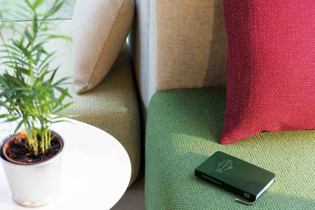
Where are we seeing colour going? Recently, colour trends have skewed heavily towards what we would describe as a warm minimalism, characterised by a quiet, cocooning quality in reaction to the challenging times we are all going through. There are elements of so many soothing aesthetics here, from wabi-sabi décor and Japandi interiors to modern rustic.
These aesthetics have a soft, floral quality that speaks to our need to be surrounded by nature as well as a certain nostalgia that helps anchor us. Here we see the return of modern glam alongside newer players like cottagecore and the grandmillenial style.
Are you under the influence of colour?
Colour combinations affect us for so many reasons, many of which are hard to define but can be immediately felt. Dive into green aesthetic décor on our Pinterest and get inspired by a whole spectrum of possibilities.