
The art of rejuvenation: how to use soothing colours to create relaxing, restorative spaces
- June 14th, 2024
-
 Trends and insights
-
 Residential
Colour can have an enormous impact on our lives. That’s because the colours we choose for our homes can profoundly affect how we feel, think and behave. Here at FibreGuard, we like to lean into the power of colour, celebrating its ability to shape calming, restorative spaces. By using our performance upholstery in shades of blue, green, and muted neutrals, you can turn your home into a soothing sanctuary.
In this blog post, we’re exploring some of the best colours to choose for relaxation and rejuvenation and how to use them in your home.
We’re also seeking inspiration from some of FibreGuard’s latest colour trends. In particular, ‘TRANSFORMATION’, which celebrates gentle, sheer textures and colours, and ‘KNOW-STALGIA’, which recognises the comforting familiarity of ‘slow’, earthy shades.
The power of soothing paint colours
Our mood can be hugely impacted by colour. The right choice of colour has the power to shape our state of mind and even improve our wellbeing if we select shades known for their soothing effects.
From the way you feel when you get out of bed in the morning, to the quality of your sleep, the colours you select for your home can have a significant impact on your life.
So how do we define calming paint colours? Well, they tend to be lightly pigmented with a subtle but meaningful connection to the natural world. Gentle greens bring to mind lush fields, for example, while pale blues reflect the sea and sky.
“Lighter tones of blue are associated with mental calm, serenity and reflection. Light blue is mentally soothing, which makes it a great colour for sleeping and dreaming.” – Colour psychologist Karen Haller, author of 'The Little Book of Colour'
Calming colours for every room
For the living room…
How do you spend your time in the living room? Our guess is that relaxation is a big priority here, but it’s also a space in which you’re likely to hang out with family and friends. Because of that, the ideal outcome is to achieve a space that feels both relaxing and sociable.
This is where soft neutrals come in. By incorporating muted shades such as cream, beige and ivory into your interior scheme, you’ll get the benefit of calming tones with the versatility of neutrals. And with FibreGuard’s easy-clean upholstery, even the palest of colours becomes a practical choice because our fabrics can easily cope with spills and sticky fingers.
Related Read: Cultivate carefree living with soft neutral room styling
For the bedroom…
To create a restful space in which you can switch off from the outside world, it’s a good idea to introduce natural textures such as wood, leather, cotton, and wool. When it comes to colour choices for your bedroom walls and upholstery, we recommend leaning into calming shades of blue or green.
"As we associate blue with water and the sky, it provides us with a sense of tranquillity, which in turn makes us feel relaxed. Green is associated with nature and helps us connect with the natural world, creating a feeling of relaxation and calmness. Having a pastel green bedroom can subconsciously calm you after a stressful day and help you get some good quality rest." – Neil Robinson, Chief Sleep Officer at bed manufacturer Sealy UK
Related Read: Creating the perfect bedroom sleep sanctuary
For the bathroom…
For a restful bathroom scheme, take inspiration from your favourite beauty salon or gym to create an at-home pampering vibe. Bright whites will create a spa-like feel, while soothing shades of duck egg blue or eau de nil green will promote rest and relaxation.
Visit our Pinterest board for more design ideas related to wellness
For the home office…
Blues, greens and neutrals also lead the way for a calming work from home space. Reliable blue – the world’s favourite colour – is our top choice because of its associations with clarity of thought and increased productivity.
“The effect of blue on our minds will depend on the intensity of the tone. The darker and more saturated the blue, the more mentally stimulating we will find it, helping us to focus, and boosting our concentration.” – Colour psychologist Karen Haller, author of 'The Little Book of Colour'
Introducing restorative upholstery colours from our 2024/2025 trends book
Trending Colour Palette 1: KNOW-STALGIA
What is ‘KNOW-STALGIA’?
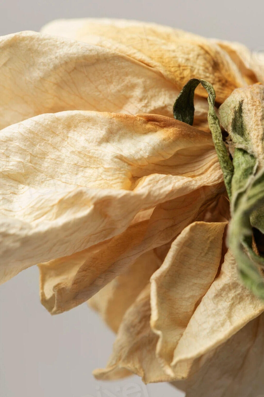
This earthy trend – as identified by our design teams for the coming year – explores the comforting familiarity of grounded colours such as sage, taupe and beige. KNOW-STALGIA is a playful take on nostalgia and self-awareness, taking inspiration from the concept of ‘slow growth’ and the importance of letting things take their own time.
What are the key colours for this trend?
Oyster white, Marzipan, Shadow Green, Apricot Tan, Elm
Find out more about KNOW-STALGIA
Trending Colour Palette 2: TRANSFORMATION
What is ‘TRANSFORMATION’?
Our TRANSFORMATION trend celebrates gentle, sheer textures and colours as we recognise the way in which lines continue to blur between technology and nature. Pale blue, pink and grey come to the fore amid cocooning shapes and fluid forms.
What are the key colours for this trend?
Chalk Blue, Pearled Ivory, Taupe, Wind Chime, Soft Pink, Porcelain Blue, Hydro, Duck Green
Find out more about TRANSFORMATION
Practical tips for choosing soothing colours for your home
When choosing paint colours for your interior, it’s important to try out samples on different walls of your home and in varying lighting conditions. When the light changes it can dramatically affect the appearance of certain colours. So while you might love a particular shade in the morning, seeing it in evening light might be a whole different matter!
“One colour can vary depending on the room and even look different as the light changes throughout the day. Light can bring out or down play the pigments and undertones of each colour.” – Charlotte Cosby, Creative Director at Farrow & Ball
When trying out colours, you can either paint them directly onto the wall or use ‘peel and stick’ samples which many paint companies now supply. These can easily be moved around from one area to another without marking or damaging your walls.
In terms of upholstery to complement calming colours, we’d recommend going for soft textures such as our slubbed yarns or bouclé fabrics.
‘Slubby’ fabrics have an uneven texture that gives a lovely, tactile quality to soft furnishings and a ‘perfectly imperfect’ look to your interior. Many of our slubbed yarn fabrics incorporate ‘strié’ – a striped effect featuring lines of colour in a similar hue to the background shade. This highly versatile fabric is the perfect choice for sofas or footstools in a relaxing living room.
For something touchably soft, why not opt for our bouclé stain-resistant upholstery? Bouclé, meaning ‘curly’ in French, is made from a yarn that’s been formed into tiny loops, giving the resulting fabric an inviting, woolly texture. This luxurious finish is the ideal partner for spaces designed to soothe and restore. Use it on contemporary, rounded sofas to give your living room a welcoming, ‘teddy bear’ vibe.
To sum up, choosing colours for your home which encourage relaxation can have a significant impact on how you feel and behave. Pale blues and greens, or layers of carefully selected muted neutrals, can help relieve stress and contribute to a calmer way of life.
Interested in finding out more about our trends predictions?
Explore our 2024/2025 Trends Book