
Interiors that sparkle with jewel tones and FibreGuard
- February 9th, 2024
-
 Inspiration
-
 Residential
Jewel tones are having their moment in the sun in the interiors world and we’re all for it. At FibreGuard, we’re big fans of jewel tone colour palettes as a way of bringing character and glamour into your home. You can rely on our colourful PFAS-free upholstery to add instant, mood-boosting joy to your interior.
But how do you go about introducing jewel tones into your home? It’s simple! Just follow our easy tips.
In this blog post, we’re going to talk you through three key trends we’ve identified when it comes to decorating with jewel tones. These are: ‘jewel-tone accent chairs and ottomans’, ‘pops of colour with jewel tones’ and ‘outdoor spaces with jewel-tone fabrics’.
Jewel-toned upholstery: where to start
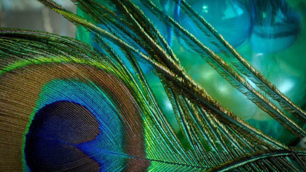
So what are jewel tone colours? Well, they take their names from precious gemstones such as emeralds, rubies and sapphires. These deeply saturated shades have luxurious connotations and can be a great way to add drama and opulence to your interior.
We’ve seen a big rise in the use of these vivid colours in recent years, with jewel tones such as emerald green and cobalt blue becoming increasingly popular.
Because colour can have such a visceral impact on how you feel and behave, it’s worth leaning into the shades you love when selecting the colour palette for your home. Find out more about the effect of colour on your mood, energy and outlook in our blog about ‘dopamine decorating’.
One of the main things to avoid when choosing a jewel tone colour palette is overwhelming the space with too many different colours. We advise limiting your colour palette to a maximum of three colours in one room to create a cohesive scheme that will be pleasing to the eye.
It’s also a good idea to apply the 60-30-10 rule. This means the main colour takes up 60% of the room, the second one 30%, and the accent colour just 10%. This approach helps to create a balanced scheme without one single colour dominating the space.
“When it comes to selecting complementary colours for your home, shades from opposite sides of the colour wheel with a similar intensity create a bold, energising look because of the high contrast. Think of a bright orange sofa positioned against a cobalt blue wall, for example.” – the FibreGuard design team
Pair a deep burgundy sofa with paler rose quartz pink and a dash of carnelian orange
Touch and texture are like the secret ingredients that, when combined, make interior spaces outstanding
Trend one: jewel-tone accent chairs and ottomans
Once you’ve settled upon the perfect colour, the easiest way to decorate with jewel tones is to bring a bold accent chair or ottoman into your interior. DIYgirls have a great example of this. Their velvo ottoman in bold mustard brings instant warmth and personality to any living room. Plus it’s made from FibreGuard’s easy-clean upholstery in durable velvet, so it will repel stains and last for years to come.
Another jewel tone colour palette to consider is deep burgundy combined with pale pink. These two colours create a pleasing and elegant contrast – as illustrated in this gorgeous interior shot featuring a sofa and chairs covered in ‘teddy bear’ bouclé.
With its royal connections, burgundy will add a sense of richness and grandeur to your home. This dark red hue, reminiscent of rubies and garnets, has risen in popularity recently, not least because ‘viva magenta’ was chosen as the Pantone Colour of the Year 2023.
Jewel tones are a great match for luxurious fabrics such as velvet, silk and chenille. The sensory nature of these vivid hues has a natural synergy with the opulence of touchably soft fabrics.
So think about pairing like with like when you’re bringing colour and fabric together for your chair or ottoman. A rich emerald green with an indulgent velvet, for example, or a royal blue with a plush chenille.
Dive into the world of velvet: The sensory delight of velvet upholstery and explore even more related reading with this article on burgundy: Colour trends: a spotlight on jewel-toned burgundy interiors
Calm grey walls in a flat steel grey let you use jewel tones fearlessly on fabrics and accessories.
Material combinations: Jewel tones radiate light and sheen, making them perfect for materials like glass and lacquer
Uchronia's signature style combines elements of classic Parisian architecture with a trippy twist. – image: goodmoods. Read more: Spring home decorating ideas from our 2023 Trends
A riot of stained glass colour and patterns in designer Pierre Marie’s apartment in the heights of the 9th arrondissement of Paris. – image: Lappartement-de-Pierre-Marie. Read more: Neo-gothic bedrooms: style spotlight
Trend two: pops of colour with jewel tones
For a more subtle approach when using jewel tones, choose a neutral backdrop in calm grey or off-white, and add pops of colour with jewel-toned performance upholstery. Cushions in teal, mustard or amethyst work really well for this trend, or you could introduce pops of colour via accessories such as photo frames, artwork or vases.
The trick is to ensure the pops of colour you add to your neutral interior are of a similar tone. Three or four emerald accents in a space, for example, will draw the eye and create a visual link across the scheme.
Opulent jewel tones also lend themselves to luxurious, reflective surfaces such as coloured glass or shiny, lacquered furniture. This combination creates a glamorous feel perfectly suited to maximalist interiors with a sense of drama.
“Beautiful woven fabrics and silks paired with a high shine, gloss surfaces on furniture and woodwork will bring jewel tones to life, creating an eclectic and luxurious atmosphere.” – Philippe Desart, Managing Director, Arte Wallcoverings
Work with accent furniture and accessories, just like your indoor space
What colours to pick? Ruby red and sapphire blue both work brilliantly
Trend three: outdoor spaces with jewel-tone upholstery
The trend for jewel tone colour palettes isn’t limited solely to indoor settings. The vivid colours of the jewel-tone spectrum also work brilliantly outside, particularly in the context of a contemporary terrace, garden or pool area.
We recommend treating the outside as you would the inside of your house. Introduce colours you love, and add accessories such as side tables, cushions and rugs. Applying similar decorating principles outdoors as you would indoors, blurs the lines between inside and outside and helps to create a relaxing and sophisticated feel.
Learn more about FibreGuard Outdoor Fabrics.
Jewel tones are the perfect choice for an outdoor seating area. In this elegant poolside scene, for example, vivid magenta sun loungers have been chosen along with cushions featuring a striking chevron pattern. Other jewel tones to try outside are ruby red, sapphire blue and teal which all pair brilliantly with water, sky and natural materials.
To recap, the three trends we’ve identified for jewel tone colour palettes are:
- ‘jewel-tone accent chairs and ottomans’
- ‘pops of colour with jewel tones’
- ‘outdoor spaces with jewel-tone fabrics’.
If you keep these three themes in mind, you’ll easily find ways to bring the joy and drama of jewel-tone upholstery fabrics into your interior.
Want to learn more about bringing jewel-toned FibreGuard stain-resistant upholstery into your home? Get in touch with our team at FibreGuard today!