
How to use complementary colours to style every part of your home
- November 2nd, 2023
-
 Inspiration
-
 Residential
At FibreGuard, we're experts in colours and materials. We completely understand that it's hard to know where to start when it comes to decorating your home.
All those choices you have to make about colours, fabrics and furniture can feel completely overwhelming. That’s why the concept of choosing complementary colours – ones that sit opposite each other on the colour wheel – can be incredibly helpful.
Read on for our expert advice on how to use complementary colour combinations in any interior space: including your home.
What are complementary colours for interior design?
Designers often refer to using ‘complementary colours’ in an interior scheme, but what does that mean? The term can actually be a little confusing, because ‘complementary colours’ are opposing colour combinations that work well together despite the fact they’re contrasting.
Colour combinations affect us for so many reasons, many of which are hard to define but can be immediately felt. - The essential colour aesthetic guide from FibreGuard’s design team
So how do we identify complementary colours? Well, the accepted practice is to choose shades that sit opposite each other on the colour wheel – a tool designers use to show the relationships between different colours. These ‘complementary’ combinations include pairings such as blue and orange, red and green, and purple and yellow.
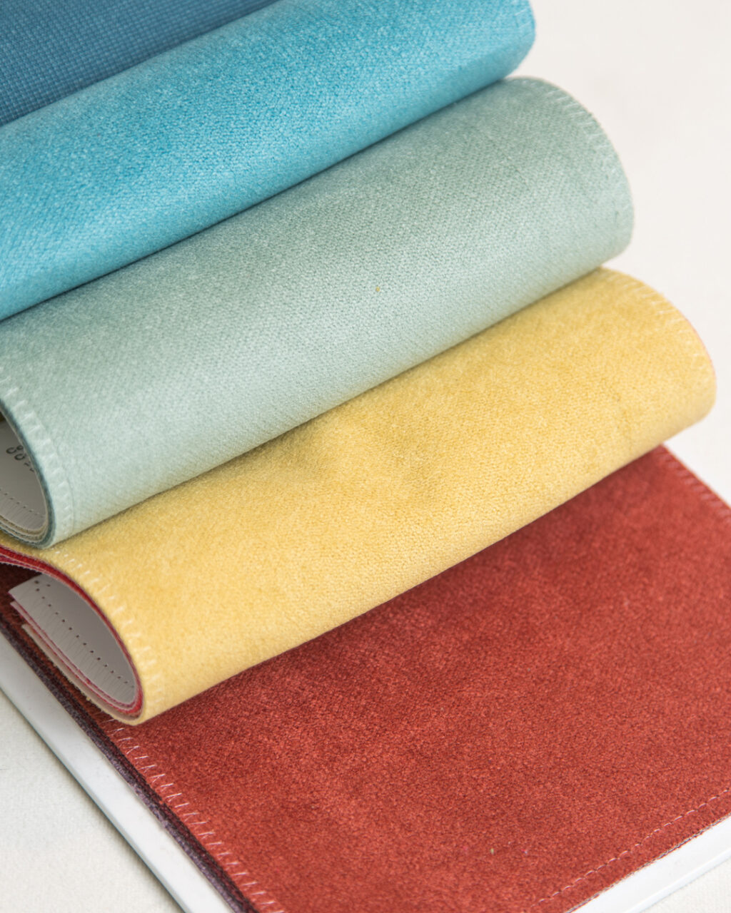
Once you've settled on the complementary colours you're going to work with, add textural depth to your choices with patterns like this beautiful collection of chenille upholstery by FibreGuard.
Creating room schemes with complementary colours
Colour psychology tells us that the hues we choose for our homes can have a huge impact on how we feel and behave in a space. That’s because – whether we’re aware of it or not – the colours around us evoke an emotional response.
“Colour creates an experience. It sparks emotion, changes a mood, influences behaviours. Every moment of every day we are making choices about what to wear, eat, and buy; where to relax or spend our money; right down to how you take your morning coffee – we are making these choices, unconsciously, based on colour.” – Colour psychologist Karen Haller, author of 'The Little Book of Colour'
When it comes to selecting complementary colours for your home, shades from opposite sides of the colour wheel with a similar intensity create a bold, energising look because of the high contrast. Think of a bright orange sofa positioned against a cobalt blue wall, for example.
To create a calming, more restful look with complementary colours, you can opt for paler versions of two opposing shades. To continue the orange and blue theme from above, picture a peach-coloured armchair placed beside pale blue curtains.
It’s also useful to limit your palette to a maximum of three colours per room, and to apply what’s called the 60-30-10 rule.
How does this rule work? Essentially, it means that:
- the main colour you choose takes up 60% of the room.
- the secondary hue 30%
- and the accent colour 10%.
This approach helps to create a balanced scheme without one single colour dominating or overwhelming the space. Learn more about the 60-30-10 rule in our blog post on neutral colour pairings: Cultivate carefree living with soft neutral room styling.
Using flat woven textured fabrics (like this one by FibreGuard!) adds a subtle depth to any space, giving a complementary colour scheme extra oomph.
How to use complementary colours in different areas of your home
So, we’ve established that selecting complementary colours can be a great starting point for your decorating scheme. But how should you approach different areas of your home which might have distinct functional requirements? Just follow our simple tips…
Living rooms
Bold colours can take centre stage here as the aim is to create a striking and memorable space that will work for both relaxing and entertaining. Looking at opposite sides of the colour wheel, combinations such as magenta and mustard, or brick red with lime green, will give maximum impact because of their high contrast.
Bedrooms: how to create a gentle oasis using complementary colours
In the bedroom, we want to create a gentler, more restful scheme to encourage relaxation and a good night’s sleep. Because of this, it makes sense to choose lower intensity complementary colours.
A pared-back version of an orange and blue combination can be seen in this lovely bedroom design (below) which pairs a pale blue upholstered headboard with a peach-toned bedspread. The overall effect is calming and serene while still being full of character thanks to the carefully chosen accessories and textures.
Dining areas: an opportunity to go bold with colour
A dining room gives you the chance to go for maximum contrast via colourful furniture and accessories that will come into their own during candlelit evenings. Set against a neutral backdrop, candles, napkins, glassware in strong complementary shades can provide the perfect accent colours in a dining area.
Why not go for bold shades of red and green (perfect for your Christmas table) or orange and blue to create a show-stopping centrepiece? Related Read: Colour blocking: How to make this bold trend work in your home.
Loving this bedroom? Discover more on Better Homes & Gardens
Did you know that our easy clean performance upholstery is available even for outdoor applications? It is! Check out FibreGuard Outdoor today.
Taking complementary colours outdoors
Complementary colours also work really well for outdoor spaces. When you’re choosing garden furniture, lighting and accessories, the colour wheel can be a great starting point.
You could opt for forest green chairs and plum-coloured cushions, for example, for your outdoor dining area. A scheme like this has the added bonus of reflecting colours that might occur naturally in your garden.
Did you know that our easy clean performance upholstery is available even for outdoor applications? It is! Check out FibreGuard Outdoor today.
For a pastel al fresco scheme, you could pair pistachio green seating with pale pink cushions and accessories to create a light and welcoming patio featuring contrasting complementary colours.
The 60-30-10 rule we discussed earlier can also be applied to ‘outdoor rooms’. For a cohesive scheme, you could choose three key colours – two of which are complementary and the third an analogous colour. Analogous shades are those that sit next to one another on the colour wheel.
An example of this approach would be a purple outdoor sofa combined with yellow cushions (complementary colours), with blue side tables adding your analogous accent colour.
Choose FibreGuard upholstery for our extensive colour possibilities
When it comes to choosing fabrics for your complementary colour scheme, FibreGuard’s stain-resistant fabrics have got all bases covered. Our ‘life-friendly' fabrics can deal with whatever you, your kids or your pets can throw at them. Any spills or stains can easily be wiped away.
Available in a wide range of colours, patterns and textures, our upholstery fabrics are highly durable while still remaining gorgeously soft to touch. Not only that, our team at FibreGuard is constantly striving to create new, innovative, high-performance fabrics which reflect the fast-moving nature of interior trends.
Let's recap, shall we?
In a nutshell, using complementary colours can be a great way to create a cohesive and highly impactful interior scheme. Whether you want a bold look with high contrast, or a subtle effect with more subdued colours, the colour wheel can be the perfect starting point for your design.
FibreGuard’s range of highly versatile and durable upholstery fabrics allows you to effortlessly mix and match complementary colours to achieve your desired look. Embrace your creative side and discover your perfect colour combinations with the help of a colour wheel.
In need of a serious injection of colour? Check out our Instagram for a feast of vibrant eye candy.