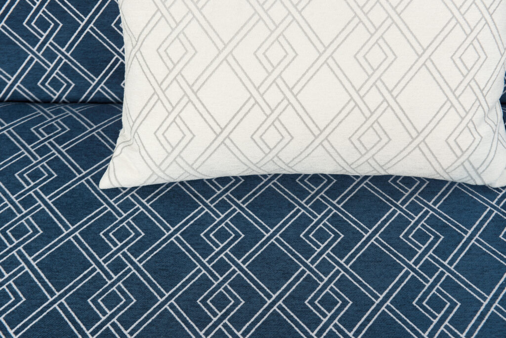
Find calm with the restful 'Classic Blue'
Back in December when The Pantone Colour Institute announced ‘Classic Blue’ as the colour for 2020, people from all levels of expertise and backgrounds were decrying their decision, saying it was too ‘safe’, and that the Colour Institute were wide off the mark.
It’s now June, and the ‘safe’ choice of Classic Blue doesn’t seem so boring after all.
In a world gripped by uncertainty and instability on many different fronts, this reassuring colour is inspiring confidence where we need it most.
It offers a connection to people in a time when we are all distant from each other in so many ways.
So how can you get a bit of elegant restfulness in your interiors? Read on…
How to use Classic Blue in home interiors
We write often about colour theory on this blog, both because it’s important and also because there’s so much to unpack. Where does this soothing blue fit into your home interiors?
Bedrooms & bathrooms are natural choices, but add a touch of Classic Blue elsewhere and you might well ask yourself why you’ve never done it before.
You have two choices with Classic Blue
Our suggestion when decorating with this particular shade of blue is to either use it as an accent colour OR go full-on monochrome.
Here are real-life examples of how to do both.
Pairing Classic Blue with a punchy, bold orange
More is more when you pair blue and orange. This daring pairing comes from Anthony George Home, using chalk paint for chic effect in an unforgettable kitchen.
It’s a bit difficult to say which is the accent colour here, but that doesn’t matter so much when your space looks this good.

Source: Anthony George Home
If you really like blue interiors, full-on monochrome is for you
If you’re not committed to drawing on your walls, you can achieve a ‘more is more’ look through a monochromatic use of colour.
As an interior design technique, it’s a way to make your space eye-catching in a courageously intentional way.

Source: Domino
Layers of blue make a sleek statement even in the most minimalist of living rooms.
Designing with monochromatic colours adds a touch of simple elegance to your home, and is a perfect technique if you’re renting and can’t change too much about a space.
Crisp, clean white interiors – now with a splash of blue
A trendy renovation in New York by the design studio White Arrow used blue to a stunning effect in a way that’s achievable for us mere mortals.
This kitchen interior in Queens was fitted with dark blue and mid-century furnishings. Aren’t the clean white walls sensational with an accent streak of matte blue? Blue cabinets may be classic, but here they have a cool style that’s anything traditional.

Source: Dezeen
Soften the effect with pastels
Designer Caitlin Wilson gave a house tour online that opened up her home in Portland, Oregon. Featuring pops of gentle, feminine colours paired with punchy patterns, it’s a thoughtful mix of colours and textures that you have to see to believe.
Her use of colour here is interesting when used as a guideline for others when looking to infuse their homes with a special personality. Wilson’s dining space uses Classic Blue with a twist, matching it with softer pastel shades and funky patterns.

Source: Apartment Therapy
Feeling blue never looked so good
Colours spark off different associations for different people. One thing is certain though: we all need serenity in our lives at one time or another...why not today?
We’re curious: what does Classic Blue mean to you? Come chat with us on Facebook!