Designing wabi-sabi hospitality spaces with smooth materials
We’ve seen a rise recently in the popularity of interiors inspired by wabi-sabi design principles. This Japanese aesthetic relies on simplicity, natural textures and a soft colour palette, so it’s easy to see why this approach works so well when designing relaxing spaces for hotel guests.
Here, we’re looking at the key features of wabi-sabi design and how the use of smooth materials can help create calm and welcoming hospitality spaces.
Wabi-sabi aesthetics in hospitality design
So what exactly does ‘wabi-sabi’ mean? Well, as with many design terms such as ‘hygge’ in Danish, there isn’t a direct English translation. ‘Wabi’ refers to a pared-back, simple beauty, while ‘sabi’ signifies a rustic patina, the kind that might occur naturally with age. Together, these two words represent a celebration of simplicity and unrefined beauty.
In hospitality settings, wabi-sabi designs are a great fit because of their authentic, ‘come as you are’ aesthetic. These interiors celebrate a fresh, rustic simplicity with a soft colour palette and an emphasis on natural materials.
The perfect way to welcome your guests and put them at ease in their new environment.
The interior designer's colour guide to wabi-sabi rooms
Although our focus in this blog is on materials, we can’t talk about wabi-sabi interiors without mentioning colour. So here’s a quick rundown of the colours most closely associated with this chilled-out, pared-back aesthetic.
Earthy tones inspired by nature lie at the heart of the wabi-sabi colour palette. Think mossy greens, muddy browns and dove greys, as well as more neutral hues such as beige, cream and off-white.
The idea is to reflect the beauty of the natural world while creating restful, grounding spaces in which to relax.
Related Read: Wabi-sabi: The stress-free design style we need
3 key design features of wabi-sabi hotel interiors
Wabi-sabi hotel spaces embody three key features that create a serene and harmonious environment for guests.
- A minimalist, uncluttered aesthetic. This design philosophy focuses on simplicity and the elimination of unnecessary elements, allowing for a clear and peaceful atmosphere.
- Natural materials and organic serenity. Incorporating elements like wood, stone, and plants, hotels create a connection with the natural world, fostering a grounding effect.
- A feeling of openness and ease. Open layouts, large windows, and unobstructed views are hallmarks of this design style, creating a sense of freedom within the space.
These three key features of minimalism, natural materials, and openness work together to provide guests with a refuge from the fast-paced world, allowing them to find a deeper connection to their surroundings.
"Wabi-sabi design is a celebration of natural and imperfect beauty. Fabrics and fibres that are perfect for wabi-sabi interiors are those that incorporate natural textures and elements such as bouclé, or those with linen, cotton, and wool characteristics." - The FibreGuard textile design team. Read more: Wabi-sabi: the stress-free design style we need.
The special qualities that smooth finishes and materials bring to an interior
The tactile quality of smooth materials adds an extra sensory dimension to an interior, promoting feelings of comfort and well-being. Smooth surfaces such as marble, porcelain and polished wood draw the eye and create a refined and enticing welcome.
When it comes to smooth fabrics, examples that sit well with wabi-sabi design include silky fabrics, satin weaves and fine velvets.
How to incorporate smooth materials into wabi-sabi hotel design
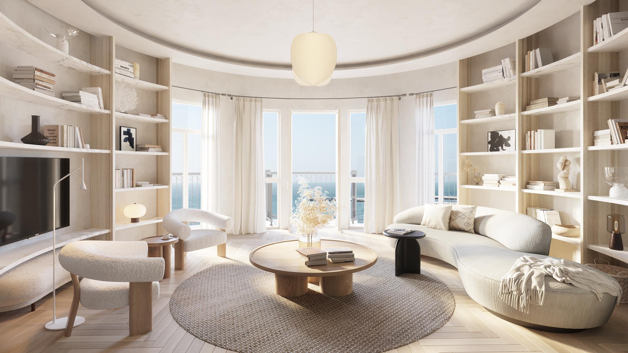
One: A minimalist, uncluttered aesthetic at The Grand, Belgium
In the case of The Grand at Nieuwpoort, Belgium, many of the interiors feature a smooth, pale wood table as a pleasing visual centrepiece. This historic hotel is being transformed into an elegant apartment building and retail space on Nieuwpoort’s seafront. We have two suggestions for hospitality designers looking to incorporate its lessons:
- Identify key areas such as flooring or seating where smooth materials like polished wood or stone can bring additional visual impact.
- Select a specific piece of furniture made from a beautifully smooth material to create a focal point.
Two: Natural elements and organic serenity at the Oku Hotel, Ibiza
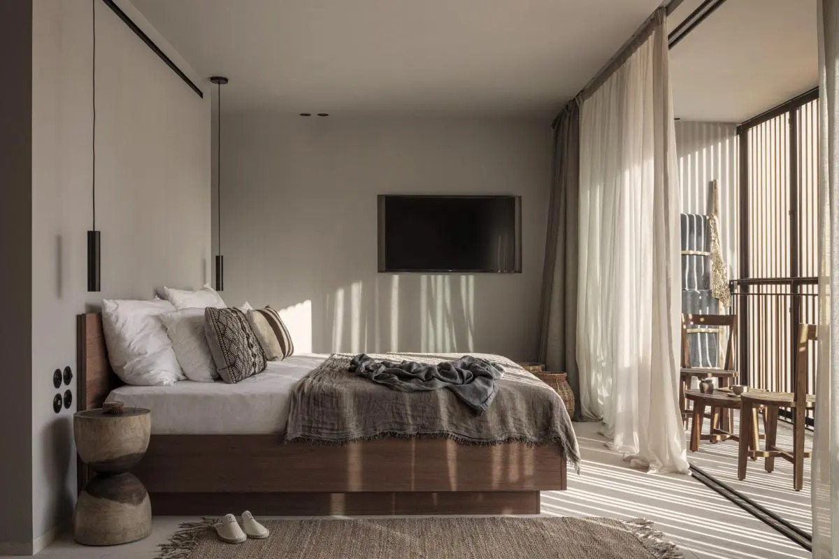
At the stylish Oku Hotel, Ibiza, earthy tones and contrasting natural materials bring an organic vibe to the space. Poured concrete elements sit alongside dark woods and dappled plaster finishes.
Our suggestions from this beautiful example include:
- Introduce layers of smooth fabrics to add character and depth to your scheme. Materials that work well for layering include close nap velvets and fabrics with a silky feel.
- Combine smooth materials with contrasting elements such as grained woods or textured rattan seating to create a balanced scheme with visual interest.
Three: A feeling of openness and ease at the Contessina Suites & Spa, Greece
The Contessina Suites & Spa, Greece is an oasis of calm on the island of Zakynthos. It features minimalist, contemporary interiors with pale fabrics adding to the feeling of openness.
The fabrics at Contessina were supplied by our sister brand, FR-One Fire Retardant fabrics. ‘Nali’ is a smooth woven fabric with a natural look and feel which can be used for both upholstery and drapery.
What to take from this location's approach?
- Remind yourself of the principles of wabi-sabi. This Japanese ethos is all about creating spaces that celebrate beauty in its simple, most authentic, form.
- Use furniture sparingly and keep it low to the ground. This will give the illusion of higher ceilings and create a more spacious feel.
- Consider your lighting choices carefully. Smooth surfaces can be enhanced with quality lighting, giving the space a subtle glow and a welcome sense of serenity.
Casa Hormiga is another beautiful example of these colours at work. It's a wonderfully rustic hotel and spa on Mexico’s Yucatán Peninsula. Guests are welcomed into a tranquil sanctuary featuring textured local materials and a soothing palette of greys, browns and beiges.
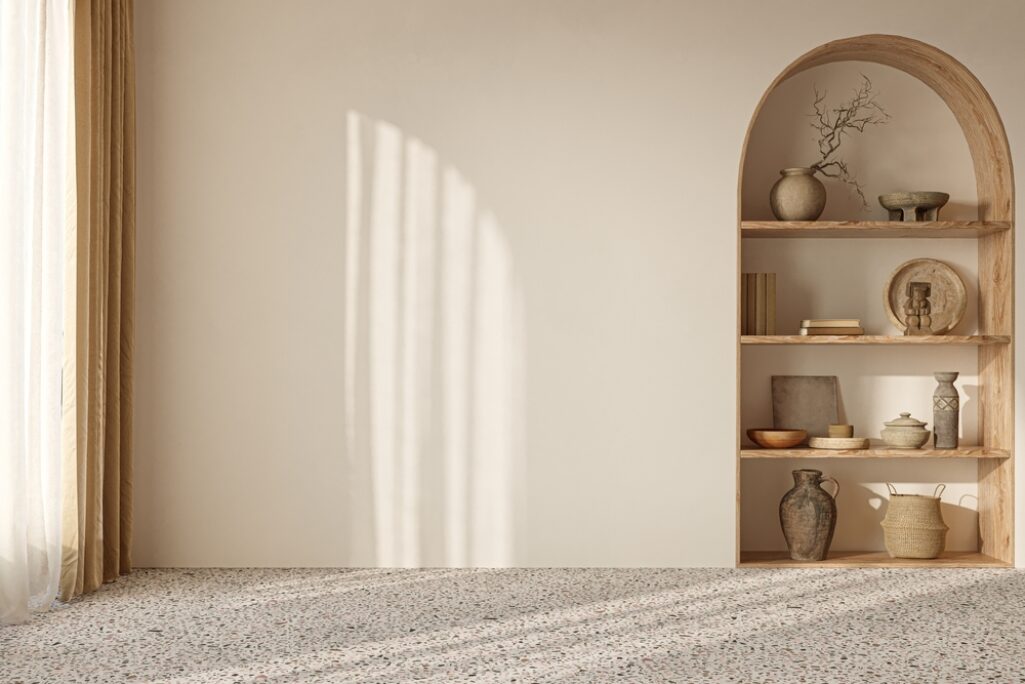
The Contessina Suites & Spa, Greece is an oasis of calm on the island of Zakynthos.

Casa Hormiga, Mexico, is another beautiful example of a wabi-sabi aesthetic at work.


Smooth textured upholstery fabrics: a match made in wabi-sabi heaven
To sum up, the ancient Japanese aesthetic of wabi-sabi is perfectly suited to hospitality spaces, thanks to its celebration of natural materials and calming, muted colours. Using smooth materials within wabi-sabi design enhances the soothing effect and helps to create relaxing spaces in which your guests will immediately feel at home.
Easy to clean, our wide variety of fabrics are ready to welcome your guests. From hotel bedrooms to lobbies, FibreGuard fabrics are durable enough to withstand all decoration use purposes.
Our performance-based fabrics are stain and splash resistant, requiring only the most basic cleaning know-how. Check out our How To Clean page to see for yourself.
Heard enough? Let’s create remarkable hospitality spaces, together.