Autumn trend watch: it's the 1970s again and Wes Anderson inspired interiors are IN
Earthy tones, dark wood, bright yellow and orange splashes have all arrived from the 1970s to reinvigorate our interiors.
But don’t worry if you didn’t catch on to this trend when it first came around; Wes Anderson is here to remind us how awesome retro interiors are and how they can really make a home feel warm and inviting.
From the furniture to the fabrics, lighting to accessories - there is no escaping the influence of this decade. So, make sure you get your mixtape ready because it's time for a spot of nostalgia!
What is it about whimsical Wes Anderson style interiors?
You know that feeling when you're watching a Wes Anderson film and you're like, "I want my house to look like this." Well, now you can.
However, if you're not familiar with Wes Anderson, he's a movie director who has a distinct style: his films are quirky, funny, and slightly unsettling. And we love it.
Described as an ‘accidental interior design icon’, his set designs have inspired everything from hotel design to café interiors – why not sip an espresso and eat a slice of tiramisu at the Prada Foundation in Milan’s Bar Luce, which was designed by Anderson himself.
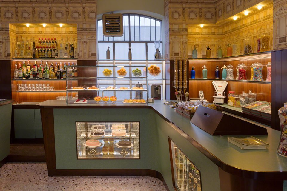
Anderson’s movies are full of super-saturated colours and strange characters who are always wearing something stunning and totally impractical. If you haven't seen a Wes Anderson film, you probably know what his set interiors look like.
“A set of hues can also act as a signature—Wes Anderson is a great example. His cotton-candy and desaturated colours are an instantly recognisable facet of his work.” - Read more: The essential colour aesthetic guide from FibreGuard’s design team
It's hard to pinpoint exactly what makes his films so iconic, but there's something about their aesthetic that just seems perfect for an autumn trend watch: it's retro without being too retro, modern without being too modern, and cosy without being too cosy.
A theatrical upholstered zebra bed frame from The Inside.

Natalie Portman in Wes Anderson’s short film Hotel Chevalier.
His style has even spawned the hugely popular Instagram account Accidentally Wes Anderson, which acts as a kind of real-world look book for fans of the film director.
1970s materials combine with Wes Anderson quirkiness
When it comes to materials, we’re seeing a definite throwback to the 1970s in the resurgence of textured walls, lacquered cabinetry and furniture, moulded plastic furniture.

Blue lacquered Campbell-Rey Apollo Side Table - GoodMoods

Pastel lacquered Up Down wall lamp from In Common With - GoodMoods
Retro colour palettes (yes, brown)
Anderson’s interior stylings are all set against a backdrop of deeply saturated colours that are equal parts seasonally appropriate and aesthetically pleasing. It's all about layers and textures—and lots of beautiful wood.
…Banish thoughts of 1970s florals, where faded browns met primrose yellow and a yolky orange in a pop art-style print. No, this is brown 2.0, the most sophisticated color in your armory. Dare we say it...brown is the new neutral. – Lilith Hudson at Living, Etc
Designer Liz Lovery also backs this up in a TikTok, saying: “Dark brown is popping up everywhere in design—I’m seeing it used on walls and in furniture—and I’m also seeing a resurgence of dark woods used in cabinetry and accent pieces.”

Set piece from Wes Anderson's The French Dispatch, 2021

A Wes Anderson inspired colour palette using our own FibreGuard fabrics

An even moodier Wes Anderson inspired colour palette using our own FibreGuard fabrics

Although a lot of Wes Anderson interiors give off a 70s, Mid-Century vibe, if you really look at the details, so many of the sets are a mish-mash of pieces from loads of different eras, like this colour explosion from Les Causeuses.
Luckily for our interiors, this quirky style also features really bright colours too: think about the stark reds and magentas of The Royal Tenenbaums. The Life Aquatic is drenched in the verve of mustard yellow, dazzling orange and shades of azure with bright tomato-red accessories.
Get the vibrant look with bold-coloured furnishings and a statement-making accent wall, or choose a unique colour and decorate with variations and complementary shades.
Our FibreGuard design team knows instinctively that colour has an immediate influence on a space, whether we are even conscious of it or not. Colour combinations affect us too as humans, and most people aren’t even aware of their influence.
Why Wes Anderson? Why now?
You wouldn’t be wrong for thinking that vibrant colours aside, this interior aesthetic features a lot of brown. And this is the key to why Anderson’s films are so inspiring for designers now: it’s the same reason brown is becoming ever more popular in interiors and decorative accessories.
Brown is comforting.
Comfort, as we pinpointed in one of this year’s megatrends, is something we want to take with us into the ‘new world’ following the global COVID-19 pandemic.
Slounge Comfort is about bringing an intentional mode of being into a post-cocooning world. Explore this trend with us on our Pinterest.
Wes Anderson’s films, however disconcertingly flawed the characters may be, are too. They create worlds where everything is handpicked and under control.
As vintage fashion and design become more popular than ever before, how does the euphoria of the 70s-80s-90s affect design? While the health crisis has exacerbated a form of nostalgia for the « world before », the need for comfort and optimism is felt. In order to reinvent the « world after », creators are remixing the utopian aspirations of the 1970s to 1990s with contemporary demands. – Retro Fantasy, from GoodMoods
Welcome to the future: retro
Explore more colour, design and visual culture trends with the FibreGuard design team. Our 2022/2023 Trends Book covers 50 pages and 5 trends, exploring the overarching preoccupations within the worlds of art, design and culture. Enjoy!