Transforming hospitality spaces: the role of texture in bar and restaurant design
In this Instagram age, the appearance of a restaurant can be just as important, if not more important, than the food and drink on offer. And although colour is crucial to the success of any interior, it’s often the textural elements that can lift a scheme from zero to hero.
Texture can create character, personality and a unique sense of place that will bring your guests back time and time again. Here, we explore some of the ways in which you can add visual interest to your bar and restaurant with the clever use of texture.
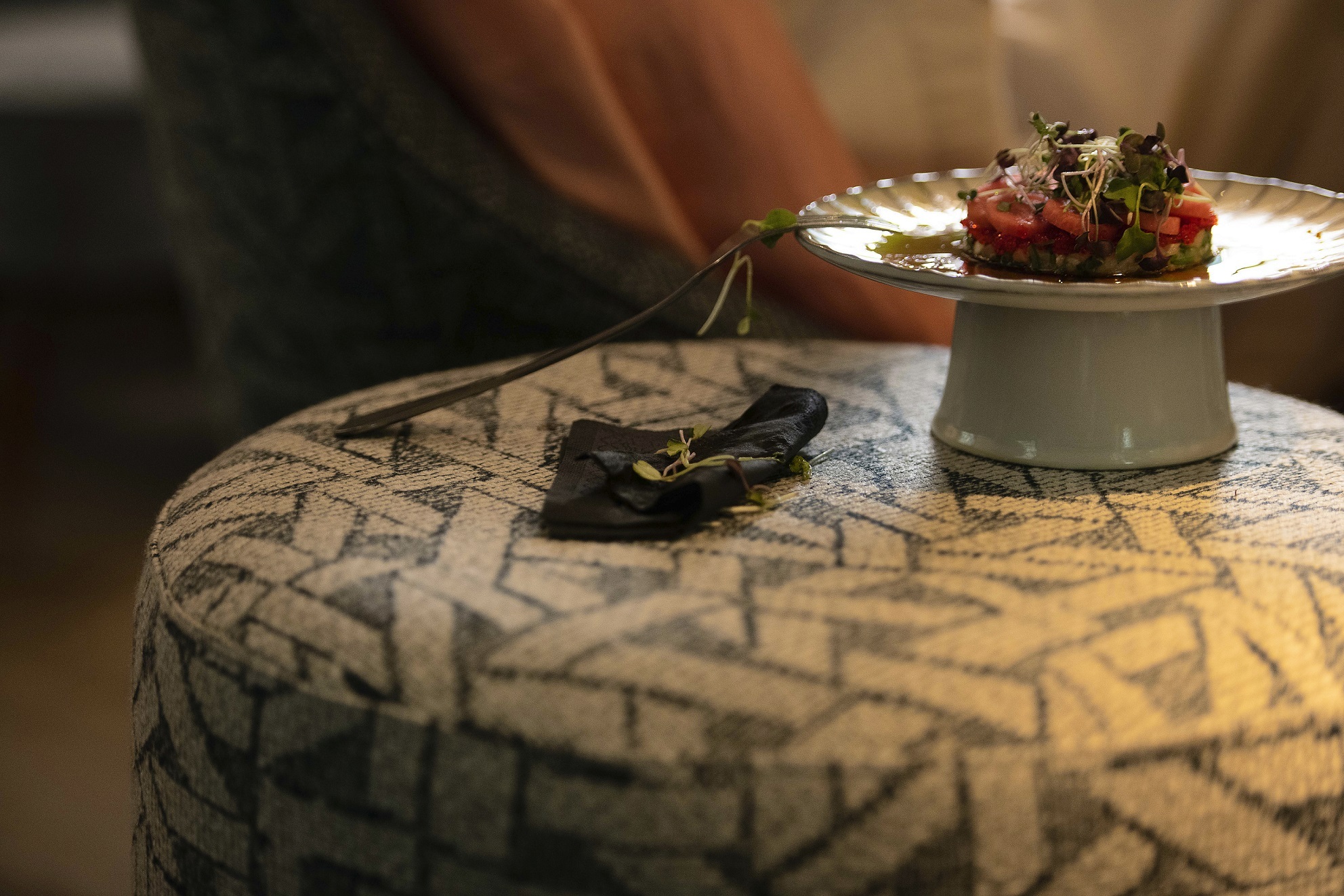
Beyond the visual: tap into the hidden power of texture in interior design
Texture can totally change the look and feel of a space, transforming it from something dull and lifeless into an environment imbued with character and personality.
By carefully selecting textures appropriate to your desired ambience, you can build a welcoming and engaging space that will speak directly to the needs of your ideal customer. For a rustic vibe, for example, you might choose to use exposed brickwork. Concrete and steel work well for an industrial look, and grained words paired with textured fabrics help create a more earthy, holistic feel.
The additional benefit of introducing fabric into your hospitality interior is its ability to improve acoustics. Softer surfaces such as carpet and fabric absorb sound and reduce reverberation making it easier for your diners to hear one another without raising their voices.
“The layering of materials, colours and shapes all amount to give your interiors an overall texture which can define the look and feel of a space. Glossy surfaces like polished chrome, shiny marble and smooth leather all in tonal shades give a room a sleek, modern texture. For a more multi-layered look, tactile weaves like bouclé look amazing when layered against the luxurious feel of faux shagreen or rough-hewn timber to give a room some depth and sense of history.” – Martin Waller, co-founder of wallpaper brand Andrew Martin.
Just past the entry bar in the Jacqueline restaurant is the "padded room," an intimate lounge clad entirely in a mash-up of Turkish upholstery and tapestry.

Striking handmade tiles on the columns in the restroom of the Jaqueline restaurant, complementing the surrounding custom wallcoverings.
Exploring the Dynamic Relationship Between Texture and Colour in Décor
Two of the strongest weapons in an interior designer’s armoury are colour and texture. So, when these two elements are combined with skill and artistry, the results can be seriously impressive.
The biggest pitfall with this approach, however, can be the tendency to go overboard and bring together too many different colours and textures. Too much and you will overwhelm your guests. Too little and they will be unimpressed and unlikely to return. It’s a tricky balance to get right.
The key here lies in creating layers of contrasting but complementary colours and textures to achieve the best possible aesthetic experience. Pairing a bold, magenta wall, for example, with textured beige linen upholstery works well, as does a richly coloured velvet combined with pale maple.
When seeking examples of interiors that get the balance of colour and texture absolutely spot on, look no further than The Royal Oak, a recently refurbished 17thCentury coaching inn in Oxfordshire. Redesigned by heralded British designer Nicola Harding, this welcoming pub features earthy colours such as chocolate brown and moss green, tactile textiles and flea market finds. The result is a welcoming, homely feel which encourages diners to settle in for the duration.
Meanwhile, in Barcelona, Jacqueline restaurant celebrates colour and texture with a stunning bar clad entirely in highly-patterned Turkish tapestry. This lavishly textured snug becomes an immersive, cocooning space which draws drinkers into its embrace.
Another striking example of the use of textured elements in restaurant design can be found in the lavish interiors of London restaurant Bacchanalia.
Five Greek-inspired sculptures by British artist Damien Hirst form the show-stopping centrepiece in the main dining room. Other textural features in this opulent restaurant include hand-painted ceiling murals, mirrored tables, and red velvet banquettes.
Related Read: 5 Colour and Texture Trends from Milan Design Week

Redesigned by heralded British designer Nicola Harding, The Royal Oak is a welcoming pub featuring earthy colours such as chocolate brown and moss green, tactile textiles and flea market finds.

The beautiful blend of colour and texture result in a welcoming, homely feel, encouraging diners at The Royal Oak to settle in for the duration.
Breaking the norms: champagne-coloured velvet in restaurants? Absolutely, with FibreGuard
So, we know texture can have a major impact on the look and feel of a space, but what about function? Well, durable fabrics such as those from FibreGuard bring major functional benefits to hospitality settings.
Not only are they hardy enough to withstand high-traffic environments, they are also easy to keep clean thanks to their embedded stain-free technology. These high-performance fabrics are available in a wide range of colours and textures suitable for restaurant upholstery, cushions and curtains.
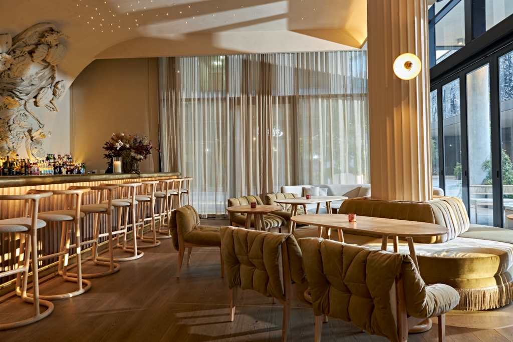
In the case of Ethos, a restaurant in Johannesburg, South Africa, the team wanted a practical fabric for the upholstery which could also deliver a stylish, upmarket look. The answer was a luxurious, champagne-coloured velvet from FibreGuard’s stain-resistant range.

Despite the likelihood of red wine spills, the team were able to select a pale fabric with confidence, knowing that FibreGuard products can repel substances such as coffee and wine. This stain-resistant effect is permanent which means the fabric will continue look as good as new, however many times it needs to be wiped clean.
3 tips for mastering texture in bar and restaurant interiors
As we said earlier, getting the balance right can be challenging when it comes to bringing texture into your restaurant or bar. How can you avoid overwhelming your guests while still creating a visually appealing space?
Follow our three tips for achieving a harmonious look with texture…
1) Choose just one dominant texture
For example, if you’re introducing both velvet and oak, make sure you use one in greater proportion than the other. That way, the two textural elements won’t compete, and the eye will be drawn to your ‘hero’ texture, making for a more pleasing visual result.
2) Limit the number of textures you use
We advise sticking to a maximum of three or four textures in any one space to avoid the design looking too cluttered.
3) Create layers of texture
Gentle contrasts delight the eye, so bring in layers of texture such as rough and smooth materials, and shiny and matt surfaces. This creates visual interest without overwhelming the senses.
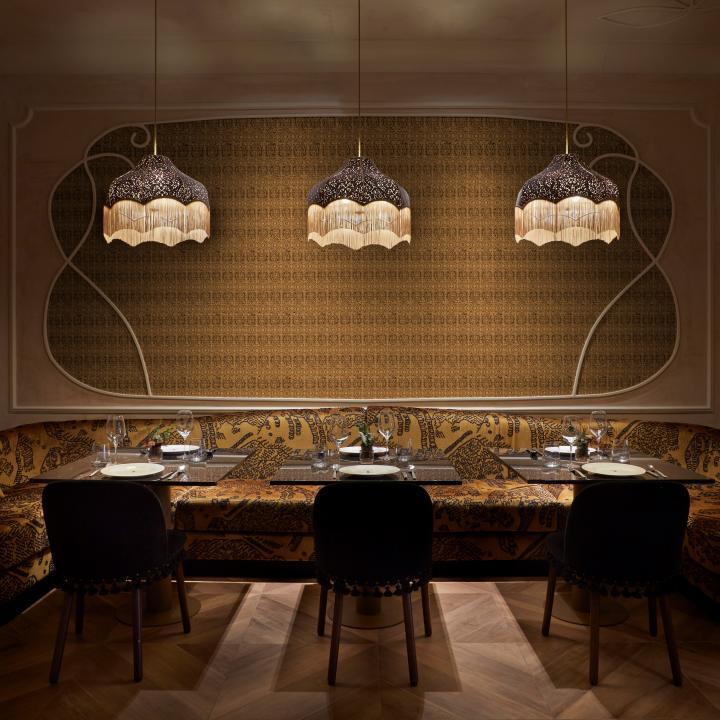
Texture: the secret ingredient in bar and restaurant interior design
To sum up, the clever use of texture in bar and restaurant design can help create a memorable experience for your guests. Bringing depth and intrigue to the scheme,
texture can affect how visitors interact with the space, building the kind of connection and loyalty that is vital for loyal, long-term customer relationships.
To explore FibreGuard's wide range of stain-resistant fabrics and to find out how they can enhance your next bar or restaurant project, contact us today.