
Cultivate carefree living with soft neutral room styling
- September 22nd, 2023
-
 Inspiration
-
 Residential
Interior design is all about creating a beautiful, comfortable environment, and the timeless appeal of soft, neutral colours and textures reflects this.
We love softness at FibreGuard.
We're proud that our soft upholstery fabrics make people feel at home in all kinds of spaces, from living rooms to airport terminals, everywhere in the world.
Today we're exploring how to incorporate soft neutrals into your interior design scheme. And what better way to do that than by showcasing our very own comfy upholstery fabrics?
What are neutral colours?
Last week on this blog we veered into the strange and vibrantly coloured world of Pop Baroque. This week we're toning the saturation way down and looking at neutral interiors.
When a neutral room really works, it looks absolutely effortless. The problem is, it's harder than you might think to get this right. The secret is to use a variety of neutral shades and to add layers of texture to create both visual and tactile interest. - Our Guide to...Decorating with Neutrals
But what are they?
For interior designers, a neutral colour is one without colour. So, for example, lighter shades like beige, ivory and taupe give the appearance of being colourless – and so do darker shades like black or grey.
Neutrals are used in room décor either in softly layered tones or as grounding ‘baseline’ colours for showier textures and accessories.
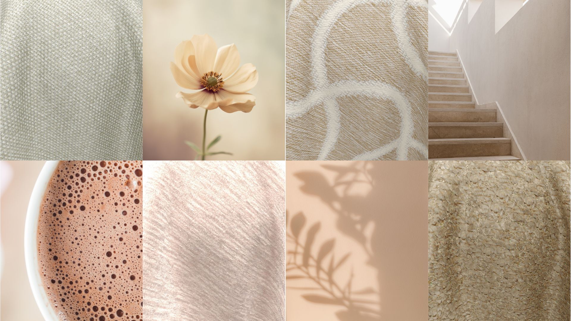
What is a 'soft neutral' colour palette?
Neutral colour palettes are not only effortlessly elegant, but they're also incredibly versatile for designers to work with. Softer neutral colour palettes, then, exclusively combine colours that are more muted.
These shades don't have the same intensity as other deeply-saturated ones—they're gentle on the eyes and create a calming atmosphere.
Here are some examples of soft neutral colour palettes:
There's a certain sophistication that blue brings to a colour palette. Pair this with naturals and you've got something truly special.
A beautiful neutral living room with cooler colour tones, featuring an incredibly plush, soft velvet upholstery by FibreGuard
A cozy yet elegant neutral living room featuring an incredibly plush, soft velvet upholstery in lovely warm tones - by FibreGuard, of course
This colour palette features warmer, linen-like shades. It’s ideal anywhere you need a subtle colour palette with warmer, grounding tones.
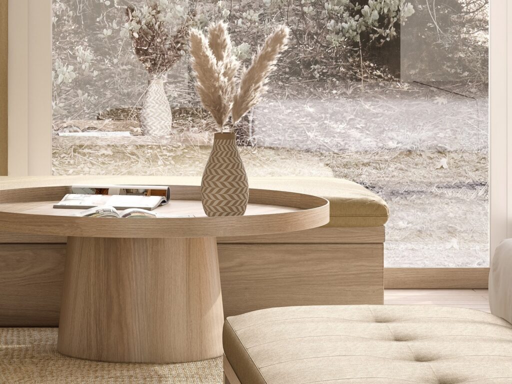
Combine soft neutral colours like a professional interior stylist with the '60-30-10' rule
The 60-30-10 rule in interior decorating is a simple formula that makes designing a room's colour scheme easy. We'll look at a beautiful living room – featuring beautiful FibreGuard upholstery! – to demonstrate what we mean.
First, the 60-30-10 rule of colour scheme styling works like this:
- 60 percent: The main colour you choose should represent 60 percent of a room.
- 30 percent: The secondary colour should represent 30 percent of a room.
- 10 percent: The accent colour you choose should represent 10 percent of a room.
Now, here's that living room we mentioned:

Why does it work so well?
- Walls, trim, rug, and flooring in a sandy tone: 60%
- Drapery, lampshades, sofa upholstery and some sofa cushions in a gentle white: 30%
- Pops of a dusky aubergine colour around the room including two toss pillows, the floral arrangement, and other small items: 10%
The perfect textures for a soft neutral room style
Once you have the colour palette sorted out, clever use of texture and touch will really make your soft neutral room sing. Soft, neutral colours are good for solidifying a room's foundation and giving the stage over to the more personal touches: decorative accessories, objects, etc.
Items that are equal parts stylish and functional are always winners, of course: this is where we bring our own soft upholstery fabrics into the mix!
Related read: Why modern rustic interiors are perfect this autumn
Introducing FibreGuard's ultra soft upholstery: you'll feel the difference
While designers might shy away from using neutral furnishing fabrics due to concerns about staining and dirt, FibreGuard offers a game-changing solution.
Our cloud-soft upholstery fabrics combine comfort with durability and easy maintenance. FibreGuard's long-lasting upholstery is so easy to clean, you can include neutral shades in your decor without worrying that they'll soon be ruined by the kids' chocolate fingers - or any other accidental stains that can happen.
Related read: Embrace a lifestyle of ‘idyllic idleness’ with the help of FibreGuard fabrics
Be brave and use neutrals everywhere!
At FibreGuard we are passionate about fabrics. We're also passionate about carefree living. We take pride in the fact that our high-performance fabrics enable people to make the design choices they love: no matter what colours or textures their hearts desire.
Embrace the timeless appeal of soft neutrals and let your creativity shine in creating a space that will remain beautiful for years to come.
Ready to say 'yes' to softer colours and carefree living? Contact us today to find your nearest FibreGuard stockist.