
Your colourful restaurant décor guide to banishing seasonal blues
- October 4th, 2019
-
 Inspiration
- Guide
Restaurant owners ready to renovate: have you thought through the ‘colour strategy’ part of your overall interior design?
If that sentence gave you terrified goosebumps, never fear. This blog post presents you with the intersection of colour theory and psychology. Using this crossover point to your advantage is a tricky skill to master, but it could make a difference to your bottom line.
Colour is an asset that is often shoved to the back of the line when decorating a restaurant or café space – white works, right? It does, but we’re here to tell you that you have options and that these options could help retain your customers in the long run.
Plus, with the days getting cold and wet in northern-hemisphere autumn, we could all do with a shot of colour inspiration to help us through the dreary days!
Commercial interior design needs colour
If the shade of your walls can already affect your mood, imagine what it could do to the patrons of your restaurant or café. The colour palettes in any interior space can have a huge impact on your attitude, your decisions, and the overall group dynamic of the people around you.
In fact, exposure to colour tones can alternatively ground you, make you happy or even suppress your appetite and calm you down…if you’re using a very specific tone of pink to decorate called Baker-Miller Pink (hex code #FF91AF), that is.
Holistic, personal and appropriate colour choices
There are many ways to use colour in your restaurant space, and in this blog post, we look at the more unusual methods.
But first, a caveat; if you’re scared you’ll end up with some manner of awful colour explosion, take a deep breath and get grounded (try staring at some sage green if you want).
It’s the holistic aspect to interior design that takes everything in the space into account, from the textures to the particular shade of paint used, to the materials in the lampshades.
Working with colour in interior design is kind of like using the Force (yes, like a Jedi): it surrounds your room and binds it together, permeating every aspect of your space.
What colour shades have to do with psychology and expectation
Let’s get to it. Colours can do a lot of heavy lifting if you look at the research done around them.
Crisp greens, juicy yellows and delicate blues, for example, are proven to positively affect mood and atmosphere. Warm colours like red and orange have been said to boost the appetite.
Will all of this really make a difference to your restaurant interior? Why not check out the research and try it out anyway – can’t hurt, right?
That being said, though, before you dive for your paintbrush there’s something we’d like to stress.
The colour of your restaurant interior depends largely on what kind of restaurant or café you own (the theme) and what kind of food or drinks you serve.
Colour and combinations of colour set expectations in the minds of your clientele, and you want to make sure their experience matches up to what you actually have to offer.
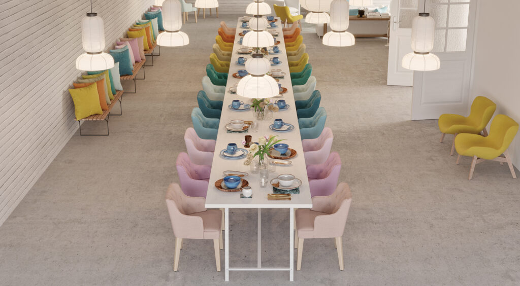
So what colours should you use to decorate your restaurant interior?
- Yellow - Yellow is the colour of sunlight and warm, lazy afternoons. It naturally awakens all the senses through its positive energy.
- Green - Green can never be ignored. It’s a stable, balanced colour, bringing the natural world to mind, which is exactly what you want in your restaurant or café, because many people are most happy when they’re out enjoying nature. It’s the colour of life, of growth and, like yellow, of positivity.
- Blue - Blue in shades like duck egg or sky blue are perfect when you need to evoke a sense of calm. A light, airy blue makes your restaurant or café space feel bigger than it is, which is perfect when you’re lacking floor space!
- Red, orange - Warm reds and oranges are relaxing, expansive colours that invite your guests to stay a little while longer and unwind. This is why you see so many big chain restaurants with red featuring largely in their branding palette. Kick the atmosphere up even further by thinking carefully about the lighting in your restaurant, bar or café, and combining it to flatter the warm colour tones.
I prefer living in colour – David Hockney
Colour is often the element of surprise
Adding visual interest and texture to your restaurant can be a smart move. Textured textile art installations and woven wall hangings are all the rage right now.
While macramé is nice and all, think bolder, and bigger: here’s a fantastic example of a rope mural wall installation that completely transforms Suviche, a restaurant in Florida, USA.
Smaller restaurants and bars can be loaded with visual interest too by using every inch of available space you have. Don’t forget your table settings, glassware, cutlery and furniture when thinking of colour.
Sometimes a furniture repaint is all your space will really need.
To get concrete with our advice, here are three ways different restaurant designers use the ceiling to pack a colour punch in an unexpected way:
Obviously, we love the one that uses fabrics as ceiling décor!
FibreGuard fabrics have a wide variety of options to fit every restaurant or café space, and they’ve been specially engineered to perform amazingly in them too!
Get in touch to learn more about our smart commercial collections and check out our cleaning page to see how easy it will be to maintain your restaurant when the refit is done and dusted.
Complementary colour combinations in interior design
If you’re not sure what colours make you happy, personally, get over to Pinterest and make a collage of photos and clippings of different colours and textures and scenes.
Combine them and see what works for you; you never know but you could use them in your café or restaurant to put a personal stamp on its interior décor.
If you’re daring to go all out, remember that clashing your colours gives a space a kind of confidence that’s unexpectedly edgy and cool.
We suggest starting your colour vision board ideas with terrazzo, a colour-packed trend that we’re seeing everywhere lately.
We’re seeing this more and more as restaurants grow more colour-aware, with some interiors even taking inspiration from famous artists like Henri Matisse.
“With colour one obtains an energy that seems to stem from witchcraft.” – Henri Matisse
Colour, restaurant interiors, and you
- Keep psychology and scientific research in mind when putting your colour palettes and entire interior design together
- Think of décor accessories, tablecloths, placemats, furniture, plate ware and even your ceilings when you’re coordinating your colours because there’s a lot of space to work with, even in the smallest of cafes or restaurants
- Don’t be afraid to be brave with colour choices in interiors
- Clashing is cool and terrazzo is fabulous
- Colourful interior design can be the bright pick-me-up your commercial space needs
We hope you’ve found this post useful and are ready to take your commercial interiors to the next level of pigment saturation. Get in touch to learn more about easy-to-clean fabrics.