
5 juicy colour and texture trends from Milan Design Week that are still with us now
- October 7th, 2022
-
 Trends and insights
-
 Residential
Milan's Salone del Mobile was back in full post-pandemic force this year, and we were so delighted to be able to attend again! While the temptation is there to immediately unpack our thoughts and feelings around what we see and experience in Milan Design Week, it’s also lovely to sit with what we’ve seen and allow our impressions to trickle down through our design thinking as the weeks go by.
Beyond the trade show itself, which is packed with the biggest names in the world of art and design, the Fuorisalone saw young creatives and smaller brands take over galleries, abandoned spaces and art hubs across the city with shows and installations, proposing new ideas for what our homes of tomorrow might look like.
From sustainability to boundary-pushing designs and an emphasis on time-honoured craft, here are some of our takeaways from the event that we’re seeing just gain in popularity and significance now, months later.
Focus on a sunny, simple life: the Hermès’ installation at La Pelota
Hermes had a huge installation inspired by water towers using coloured paper rice - inside an intimist presentation of their house collection.
Lightness was the theme of this year’s presentation, with special attention to sunny, bright home textiles. The installation recalls the emphasis on a slower, simpler pace of life that was pushed upon us during the corona pandemic: and how we want to keep this with us as we move into a post-pandemic world.
We loved that the patterning on this retro-inspired yellow and white dinner service...
...was used as inspiration for outdoor furniture
A gentle realm of comfort from Loro Piana Interiors
Loro Piana - well-known brand for high wool quality - has transformed their headquarters Cortile della Seta into a panorama of soft undulating dunes. Simply designed furniture (hosted sofas, méridiennes, armchairs, stools, side and coffee tables) was hidden and revealed simultaneously through the beige / camel coloured installation.
“This all started with a desire to look into the meaning of comfort. We wanted to ask ourselves, what is comfort, and question how we relate to the sensorial aspect furniture." Designer Raphael Navot, at Hypebeast
The installation was conceived as a landscape, and made us think of Slounge Comfort, one of our over-arching meta themes for these times. It is a homebody of a theme. Our homes, which became our whole worlds, reflect our souls more than ever now.
Quilted materials, fluffy with neutral shades, warm up everything from the sofas in our living rooms to the architectural interiors we inhabit.
Designer Raphael Navot explored the human hand with his furniture collection for Loro Piana at Milan Design Week
Taking colour trends from Salone del Mobile into the future
As always, we were excited to explore the wealth of colour at Milan Design Week, and now, months later, we’re seeing our favourites popping up everywhere, from lighting design to furniture styling.
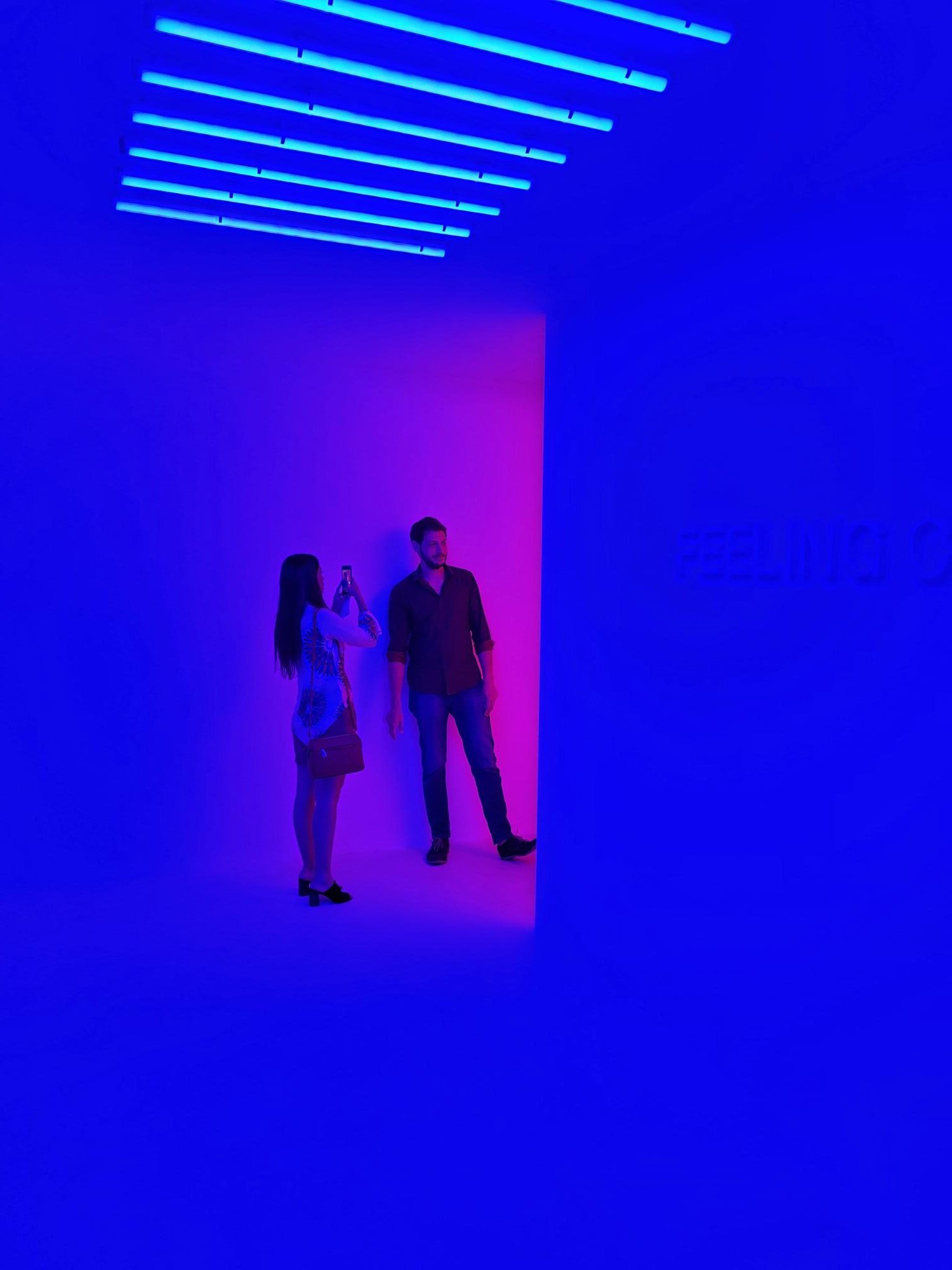
Cobalt blue
We noticed bright cobalt blue associated with magenta pink in a few of the light installations. Now that it’s autumn, cobalt blue as a trending colour is coming into its own, proving surprisingly popular in residential interiors and object design.
“Cobalt is on the rise in home design because we’re entering a postmodern movement.” says Sarai Reed, Homesense design consultant, to TZR.
Related: Find calm with the restful 'Classic Blue'
Peacock, pink and mint
There were also plenty of pink, mint and peacock shades used throughout the fair, in all different applications. Sapphire, emerald, amber, ruby and amethyst are everywhere now even as the year moves into winter.
These gorgeous jewel tones create a lush, colourful treasure chest in room styling.
Related: 3 glamorous ways to make your interiors sparkle
Is Burgundy back?
Burgundy is a dark reddish-brown inspired by the colour of wine from the Burgundy region of France. This deep, dark red colour with violet tones is a reserved, grounding colour, instilling feelings of security and comfort.
It makes sense that we’re seeing it everywhere in recent weeks – it has a timeless elegance and a warming vibe of mulled wine that’s strongly associated with this time of year.
Cobalt blue appearing in this deliciously furry lamp by Uzumaki Gallery
Is burgundy back? All signs point to yes: we're seeing it everywhere now, even statement wallpaper like this from belarteSTUDIO.
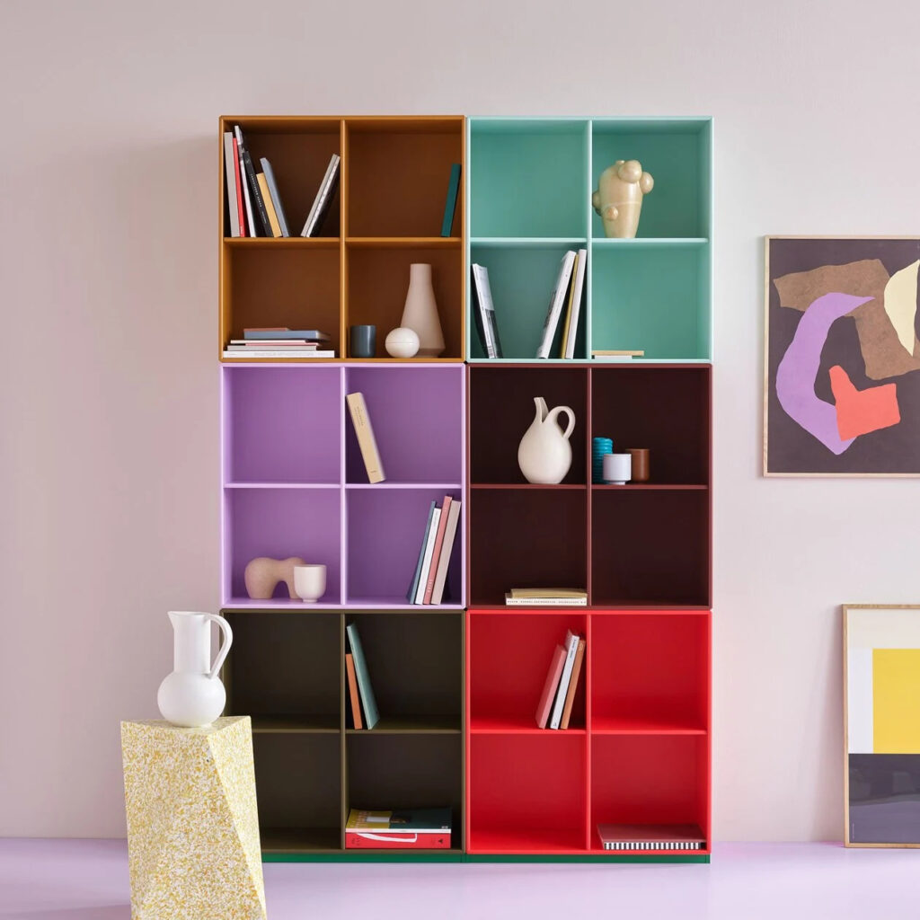
Months later, shades that were popular at Milan, like peacock and mint, are coming into their own, as in this new living room collection by Montana Furniture.
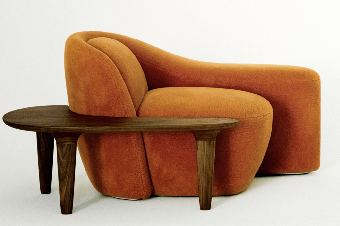
Cobalt blue and puffy textures in furniture design - Mutation Club Chairs, by Maarten de Ceulaer
The state of textures: loveable textiles and translucent materials
By far the most noticeable texture trends included plush, comfy fabrics that you can curl up into.
Bouclé textures at the Salone del Mobile reigned supreme: you couldn’t miss them. Cuddly furniture and bouclé itself are only gaining in popularity now as we head into the end of the year and the beginning of a new one.
Related: Style spotlight on bouclé yarn and FibreGuard fabrics
Soft textures were taken beyond furniture too, as in this stunningly striking furry wall covering used in a classic Italian Palazzo. It all matched perfectly: utterly amazing!
The Elle Decor show at Palazzo Bovara showcased Design Forever, an exhibition that paid tribute to the history of the Salone.
At Milan there were bouclé textures as far as the eye could see.
Mesmerising iridescence in delicate pinks and glossy finishes.
Natural blue onyx marble is appearing more and more now in furniture design.
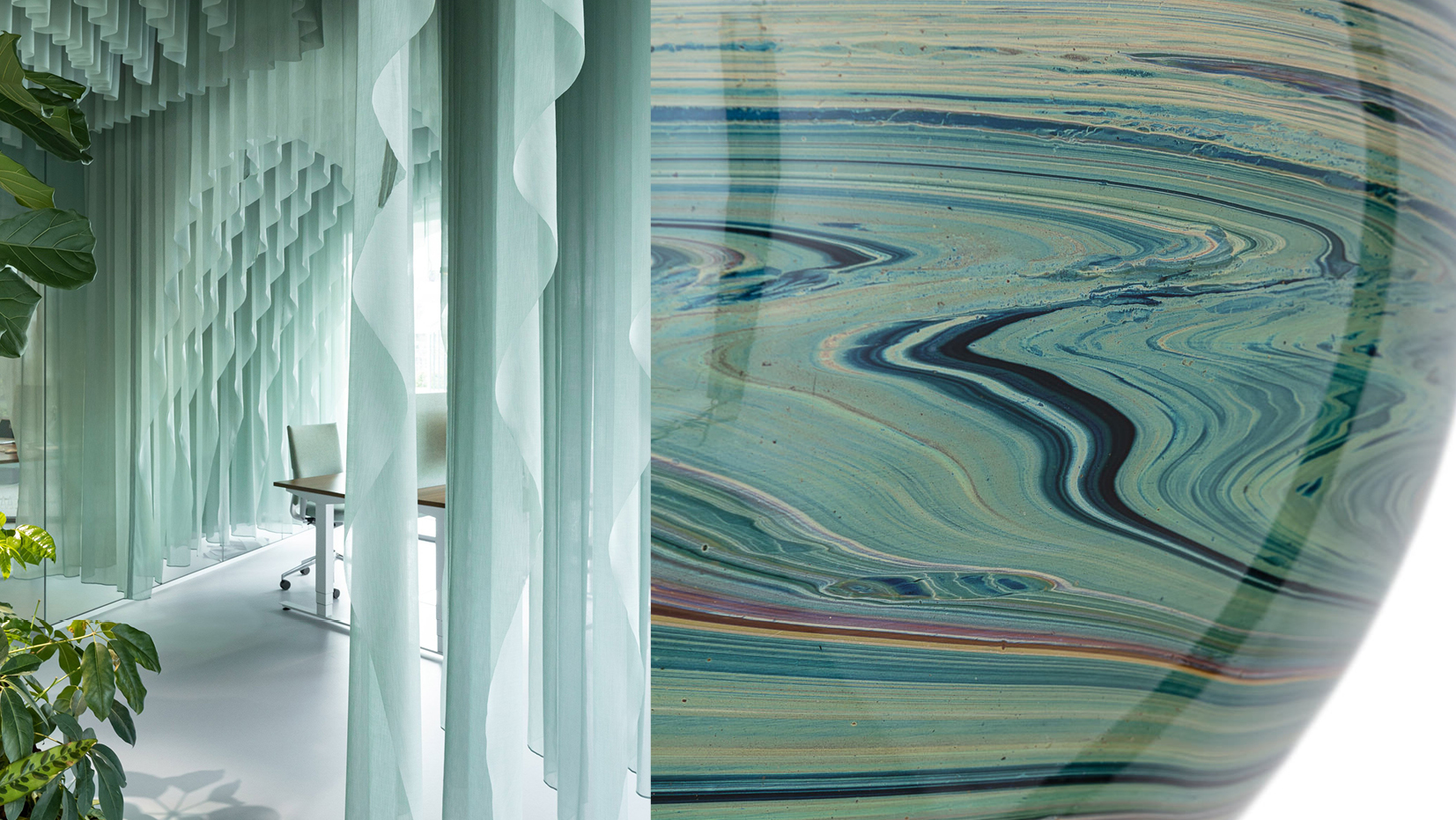
We also spotted plenty of dining and coffee tables in marble, showcasing veined and cloudy textures.
In the design world, marble elements are a tribute to longevity and timelessness. In recent weeks we’ve observed that the classic black and white marble look is being left behind in favour of the fascinating shades of onyx marble. Furniture designers are exploring the raw sensual beauty of translucent limestone in luminous and stunningly sumptuous creations.
To achieve an elegant, abstract look, our designers advise to keep the main materials in the space limited and create visual interest through the different textures.
Trend watching at FibreGuard
Because the point of visual trends is to prepare us for what should be coming down the pipeline, it was also interesting to see pieces that managed to find a balance between looking forward and telling us something about ourselves.
Observations about how we process information visually and express ourselves in our shared spaces were particularly compelling: Does a particular trend in colour palettes or shape make you think of home? Do you recognize that pattern from your childhood teddy bear?
As the year develops, we’ve seen that the longstanding trend towards mixing and matching is still here -- and at this point, our colour palettes and texture libraries are starting to look more like kaleidoscopes than separate boxes.
Our in-house team of designers, artists and product developers are always observing the rise and fall of trends across a wide range of fields from product design, fashion, interior décor, architecture, art, and visual culture. They draw on their own unique experiences and perspectives, cultural shifts and nuances, and world events.
If you want to know more about our trends forecast for 2022/2023, check out our dedicated website.